
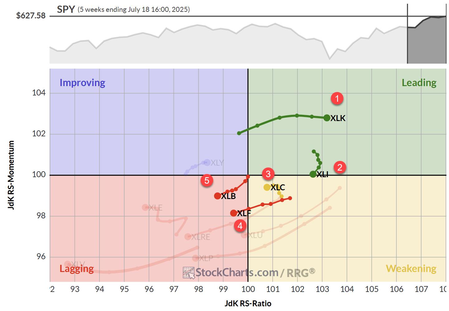
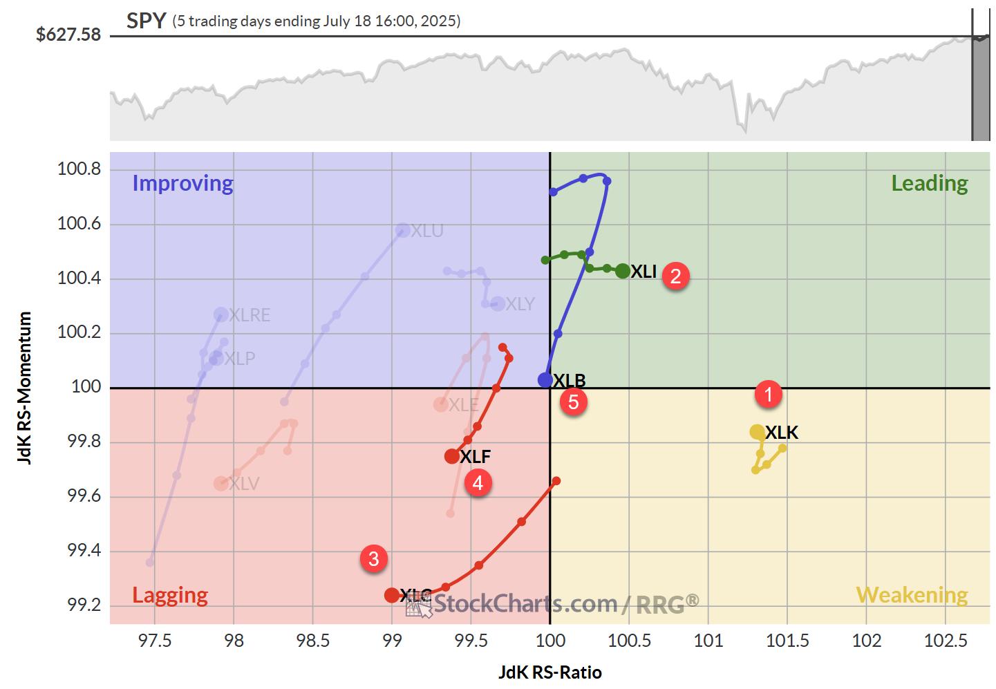
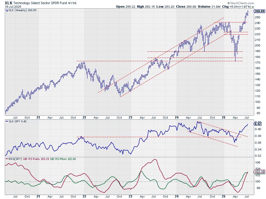
Here are some charts that reflect our areas of focus this week at TrendInvestorPro. SPY and QQQ are leading the market, but the tech trade is looking extended and ripe for a rest. Small-caps are still underperforming large-caps. Even though Utilities are not leading in percentage terms, XLU is leading on the chart as it confirms a bullish continuation pattern. Elsewhere, metals are leading in 2025 and the Home Construction ETF is hitting its moment of truth.
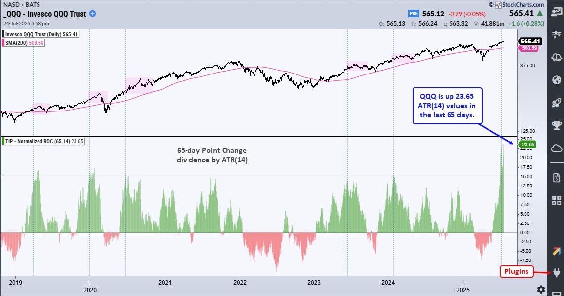
A 20+ ATR Move for QQQ
In 14-period ATR terms, QQQ is up 23.65 ATRs in the last 65 days. This is the highest number ever. The indicator window shows the 65-day point change divided by ATR(14). The blue dotted lines show when this indicator exceeds 15, and this is the sixth occurrence in seven years. Values above 15 reflect strong upside momentum, and this is long-term bullish. Short-term, however, high values mean QQQ is overbought and ripe for a rest. This indicator is one of 11 indicators in the TIP Indicator-Edge Plugin for StockCharts ACP.
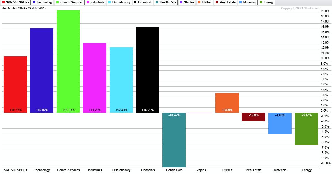
Healthcare is the Weakest Sector
The Healthcare SPDR (XLV) is the most unloved sector over the last 200 days (since October 4th). SPY is up 10.72% with five offensive sectors leading the way (XLK, XLC, XLI, XLY, XLF). Healthcare is down 10.47%, and severely lagging. Elsewhere, Staples, Real Estate, Materials and Energy are down, but Utilities are up (3.68%).
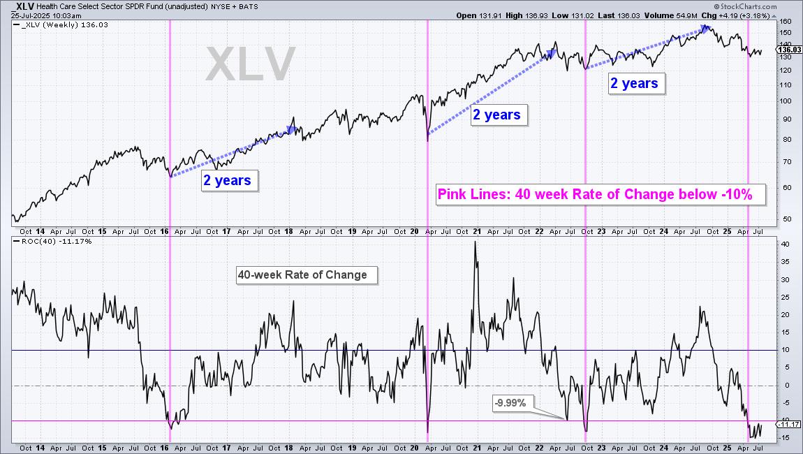
XLV Becomes Long-term Oversold
The Healthcare SPDR (XLV) is long-term oversold and this could pave the way for a recovery, eventually. The chart below shows weekly bars with 40-week Rate-of-Change in the lower window. ROC(40) dipped below -10% for the fourth time in the last 12 years. After the first three dips below -10%, XLV was up over 20% in the following two years.
This week at TrendInvestorPro
- Sentiment and seasonality indicators to watch in the coming months.
- Breadth improves, but S&P 1500 indicators are short of bullish signals.
- Bitcoin, Blockchain and Telecom ETFs break out.
- Copper and Palladium ETFs follow through on breakouts.
Click here to take a trial and gain immediate access to our reports and videos.
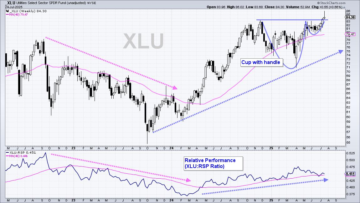
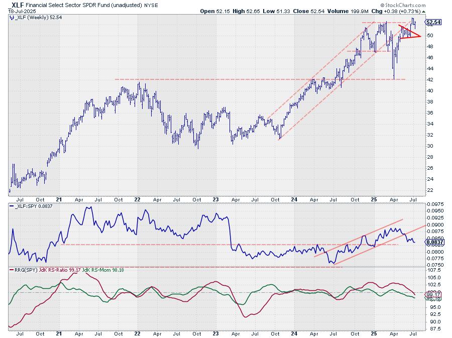
XLU Leads with New High
Even though the Utilities SPDR (XLU) cannot keep pace with the Technology SPDR (XLK) and Communication Services SPDR (XLC), it is in a leading uptrend. XLU formed a cup-with-handle from November to July and broke to new highs the last two weeks. ETFs hitting new highs are in strong uptrends and should be on our radar.
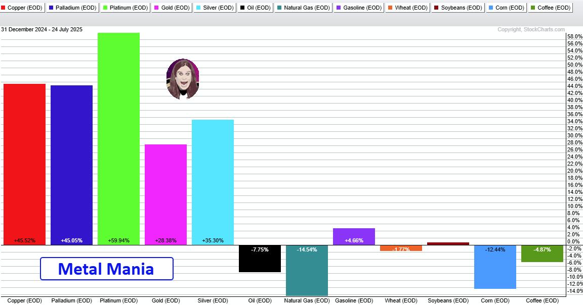
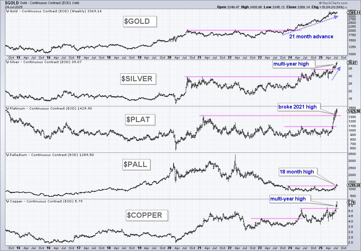
Metal Mania in 2025
In a tribute to Ozzy, metals are leading the way higher in 2025. The PerfChart below shows year-to-date performance for the continuous futures for 12 commodities. Copper, Platinum and Palladium are up more than 45% year-to-date, while Gold is up 28.38% and Silver is up 35.30%. QQQ is up 10.52% year-to-date, but lagging these metals. The other commodities are mixed.
Multi-Year Highs for Silver and Copper
The next chart shows 11 year bar charts for five metals. Gold broke out in early 2024 and led the metals move with an advance the last 21 months. Silver and copper broke out to multi-year highs. Platinum broke above its 2021 high and Palladium got in the action with an 18 month high. There is a clear message here: metals are moving higher and leading as a group.
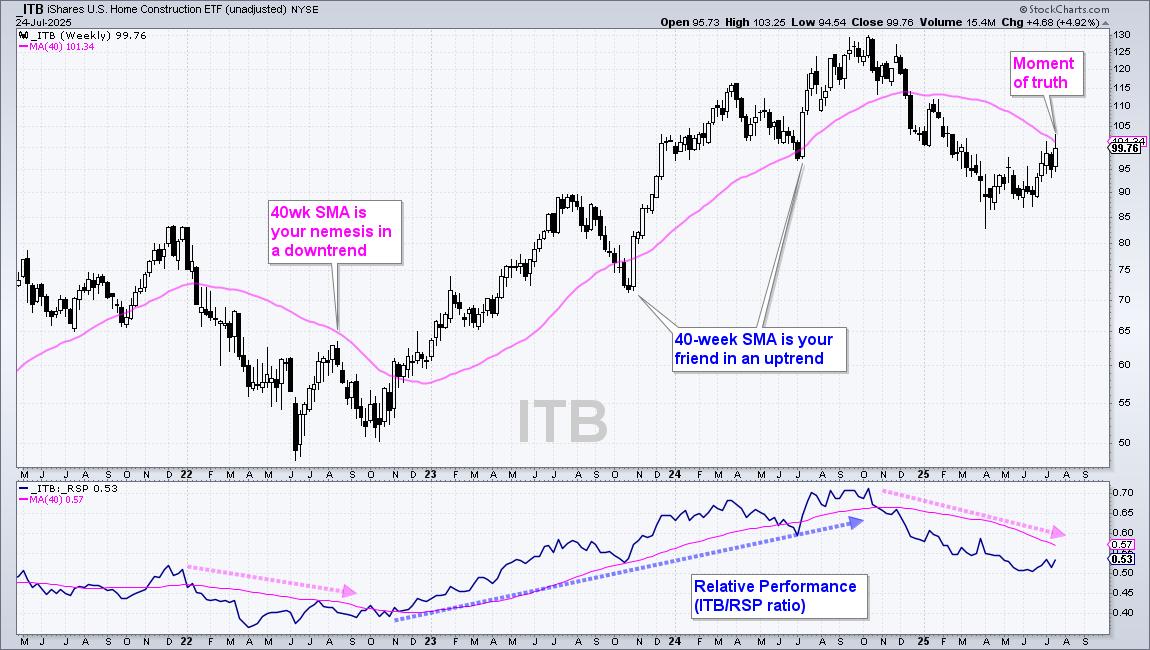
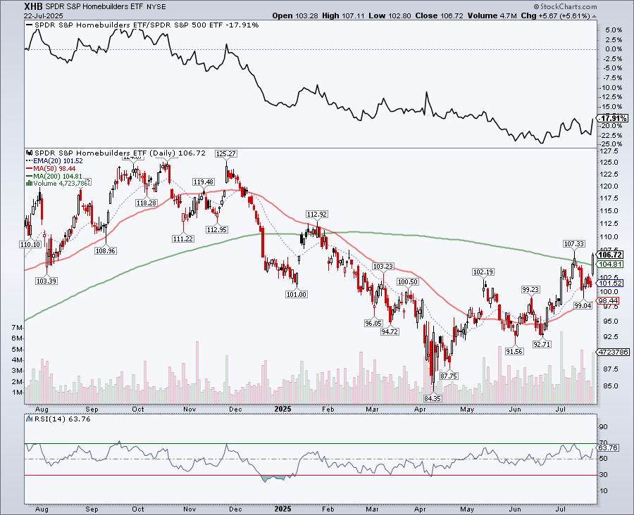
Home Construction Hits Moment of Truth
The Home Construction ETF (ITB) hit its moment of truth as it rose to its falling 40-week SMA. Notice that ITB failed just below this moving average in August 2023. During the 2023-2024 uptrend, the 40-week SMA was more friendly as ITB reversed near this level in October 2023 and June 2024. ITB surged to the falling 40-week SMA in July, but the long-term trend is down and this area could be its nemesis.
Thanks for Tuning in!
See TrendInvestorPro.com for more…

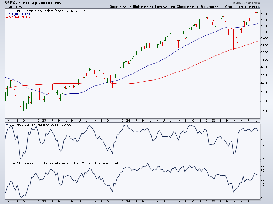
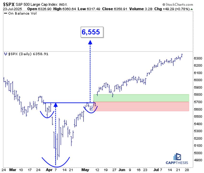
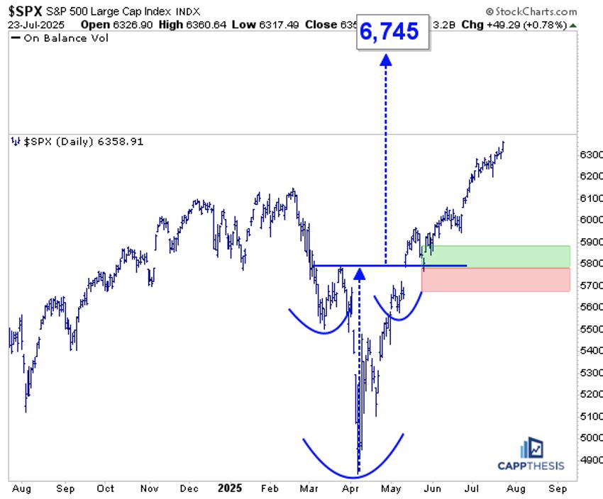
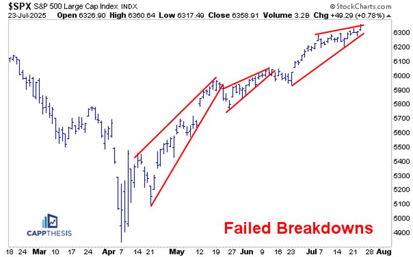
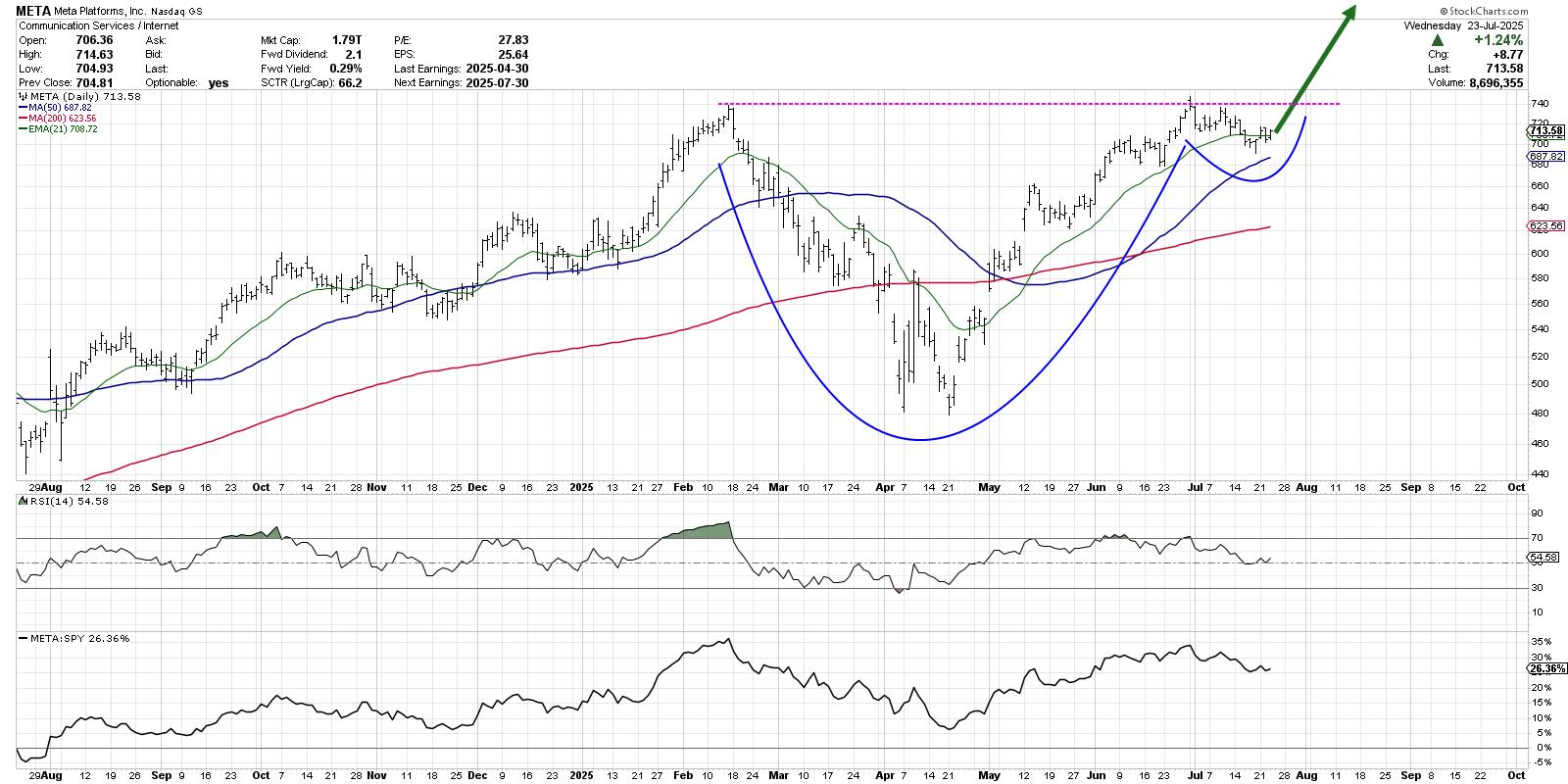
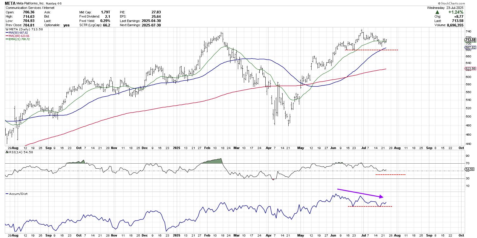
 The S&P 500 ($SPX) just logged its fifth straight trading box breakout, which means that, of the five trading ranges the index has experienced since the April lows, all have been resolved to the upside.
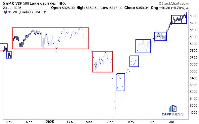


 In this video

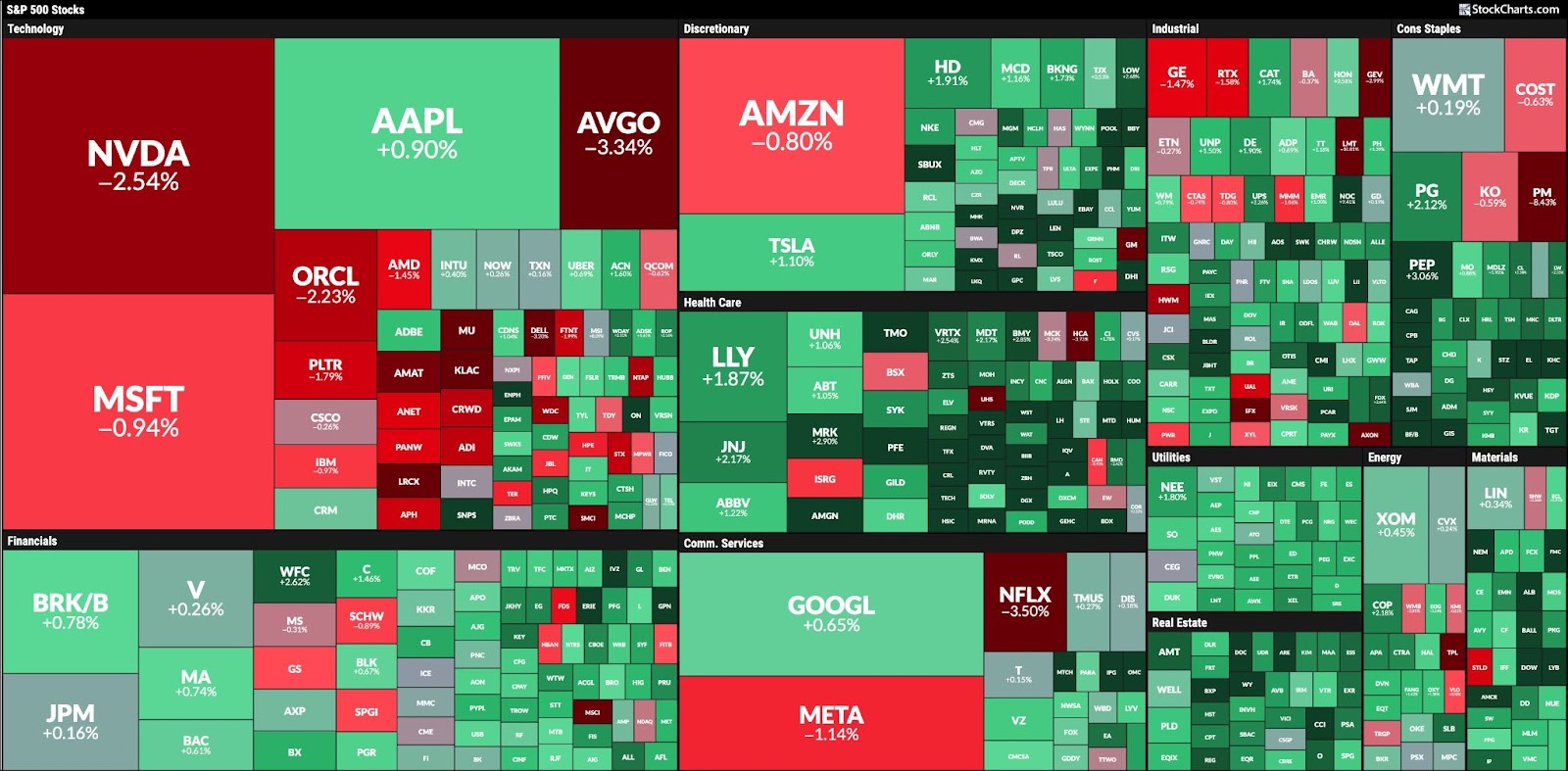
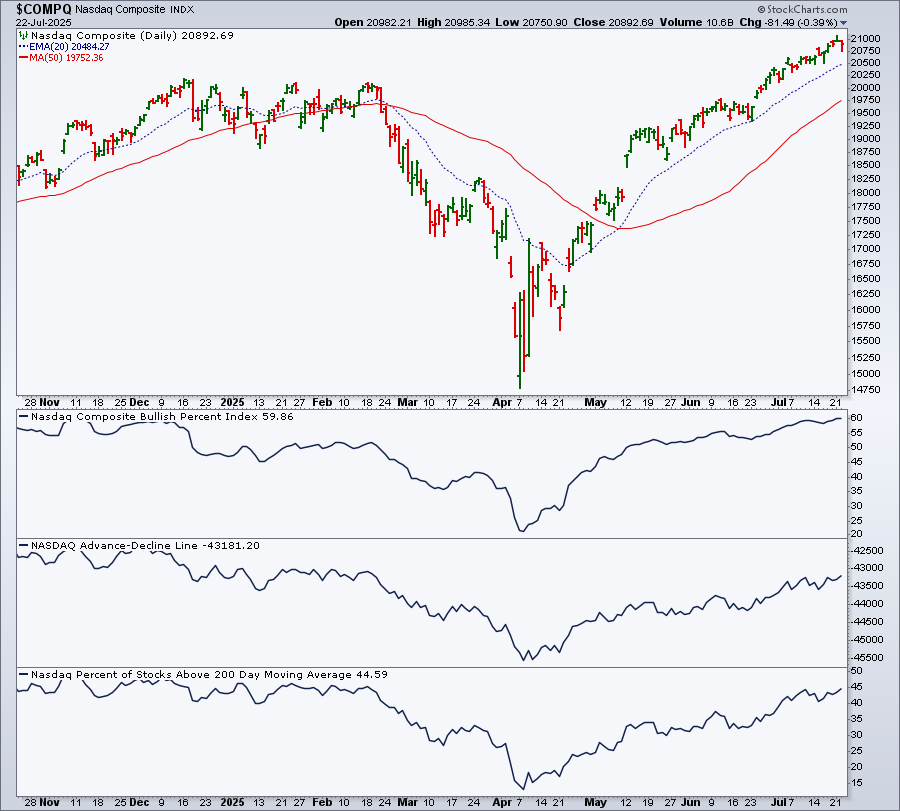
 Even with a few short-lived roller coaster rides, the stock market had a strong week. Though there was some selling on Friday, the S&P 500 ($SPX) and Nasdaq Composite ($COMPQ) closed up over the week as a whole, while the Dow Jones Industrial Average ($INDU) closed lower by 0.07%.