

This week, let’s dive into three interesting stocks: a well-known Dow stalwart, a tech giant in a tug of war, and a former Dow member showing signs of revival. Whether you’re looking for opportunity, caution, or something worth watching, there’s a little something here for every thoughtful investor.
Sherwin-Williams (SHW): Painting a Better Picture?
Sherwin-Williams, Co. (SHW) comes into earnings flat year-to-date, and is hoping that a solid quarterly result can turn the price around. This Dow stock, and the second biggest member of the Materials Select Sector SPDR ETF (XLB), has traded higher after three of its last four results and has an average expected move of +/- 3.6% when it reports.
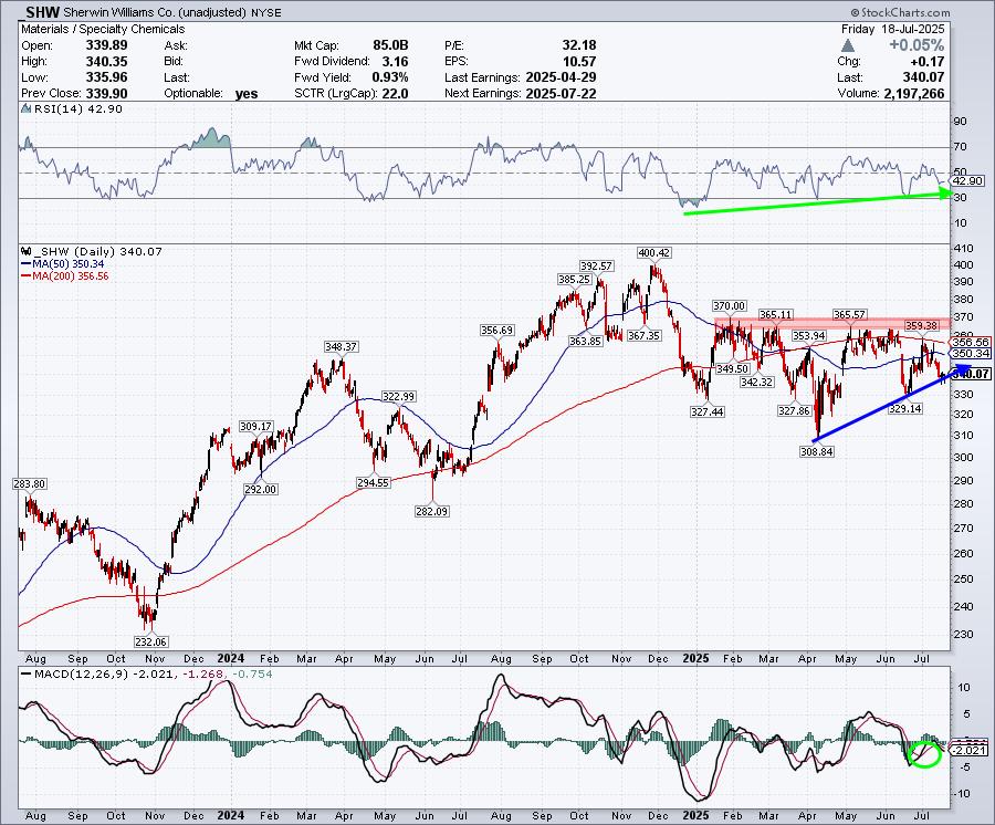
FIGURE 1. DAILY CHART OF SHERWIN-WILLIAMS. The uptrend needs to hold to maintain the uptrend.Chart source: StockCharts.com. For educational purposes.
From a technical perspective, there are some bright spots. The reality, however, is that the stock has a lot of work to do to be considered healthy again. And from a risk/reward metric, this recent uptrend from the lows needs to hold. Otherwise, look for a retest of the $310 level on a dip.
The good, the bad, and the ugly:
Shares continue to make higher lows, which is a bullish sign
There’s bullish divergence in its Relative Strength Index (RSI) — it’s going higher while the stock stalls
The MACD gave us a short-lived buy signal and has now turned negative
Trading below both key moving averages
There’s major resistance at the $360 level
This is one to put on your watchlist, with definitive risk/reward levels to monitor. To jump in ahead of earnings seems more of a crapshoot, so reacting to price action may be the best play. Patience may be your best friend.
Alphabet (GOOGL): A Mag Stock or Just Mag History?
Alphabet, one of the “Magnificent 7” stocks, has had a rough ride lately. The company has been facing continual headwinds due to antitrust and litigation risk, AI competition disrupting search, and a massive CapEx spend.
Shares have been stuck in neutral for the last year. They are lower by -2.5% year-to-date and 11% off all-time highs. If the company can address these concerns and focus on the positives of its YouTube and Waymo divisions, it could be back on the upswing.
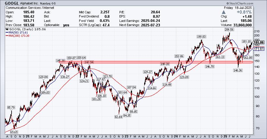
FIGURE 2. DAILY CHART OF GOOGL STOCK. It’s in the middle of a rebound and could be at an interesting pivot point.Chart source: StockCharts.com. For educational purposes.
Technically, I will keep this five-year daily chart as simple as possible. It’s intriguing, to say the least.
GOOGL was dangerously close to breaking down in early April, but quickly regained its key support level. Now it finds itself in the middle of a nice rebound and at an interesting pivot point. The bull case is more concrete at these levels, but I’m sure the bears are looking at a potential head-and-shoulders topping formation in the works as well.
As we examine, watch the 50 and 200-day moving averages closely. They are at a key consolidation area and need to act as support in a small downturn. If not, then back to the major support area we go, and a potential head-and-shoulders top is in play.
The good news is that overall momentum continues to favor the upside. We have a good support area at the averages (your risk) and then a potential run to $200 easily if we get a nice pop on earnings. If so, this could be the fourth of the “Magnificent 7” stocks trading at all-time highs.
Intel (INTC): A Blast From the Past, Showing Signs of Life?
Remember Intel? It once dominated the landscape during the dot-com era, was a proud member of the Dow, and now is just a struggling former tech giant trying to stay relevant in a challenging environment. We are not claiming they are back by any stretch, but maybe the worst is over for now, as new management and constructive price action have set up a “deja vu” trade that hearkens back to early 2023.
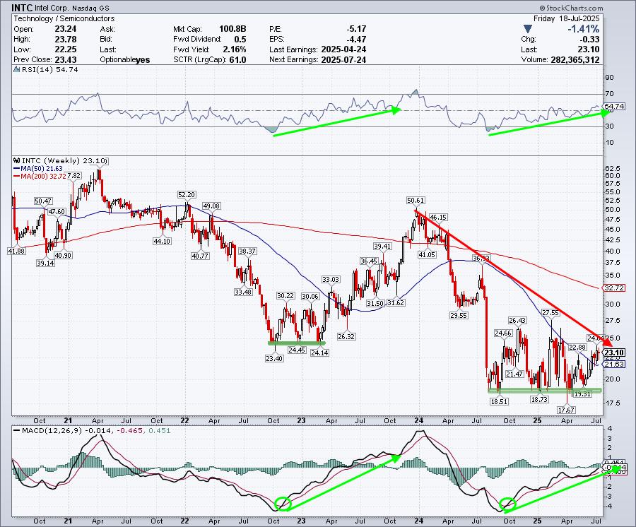
FIGURE 3. WEEKLY CHART OF INTC STOCK. The stock is above its 50-week moving average, there’s a bullish divergence in the RSI and MACD, and the bottom base was tested several times.
Chart source: StockCharts.com. For educational purposes.
Technically, we highlight price action daily over a five-year weekly period. The risk/reward set-up seems quite favorable at current levels and also looks eerily similar to its last rebound.
Here’s the current scenario that also occurred in 2022/2023.
Bottom/base that was tested multiple times and held
Bullish divergence in both key momentum indicators – RSI and MACD
Price followed and broke above the 50-week moving average
Price was over 40% below its 200-week moving average — something to reverse
In 2023, shares rallied back. Will this situation resolve similarly?
The risk to the downside seems worth the possible reward up to the moving average. Whether or not the stock has turned it around completely is a different story, but for now, the tide seems to be shifting.
The Bottom Line
These three stocks offer a mix of opportunity and caution. Be sure to add these stock to your ChartLists and watch the action unfold as the companies report earnings.


 Join Tom as he covers key inflation data, earnings season highlights, and sector rotation trends. He breaks down recent price action in major indexes like the S&P 500 and Nasdaq, with a close look at the 20-day moving average as a support gauge. Tom spotlights standout industry groups such as gambling, semiconductors, software, and aerospace, and shares charts of top-performing stocks like Goldman Sachs, Johnson & Johnson, and PNC. Tom highlights under-performing areas like insurance brokers and home improvement, then reviews several strong earnings reactions, including Monarch Casino’s 15% after-hours gain.

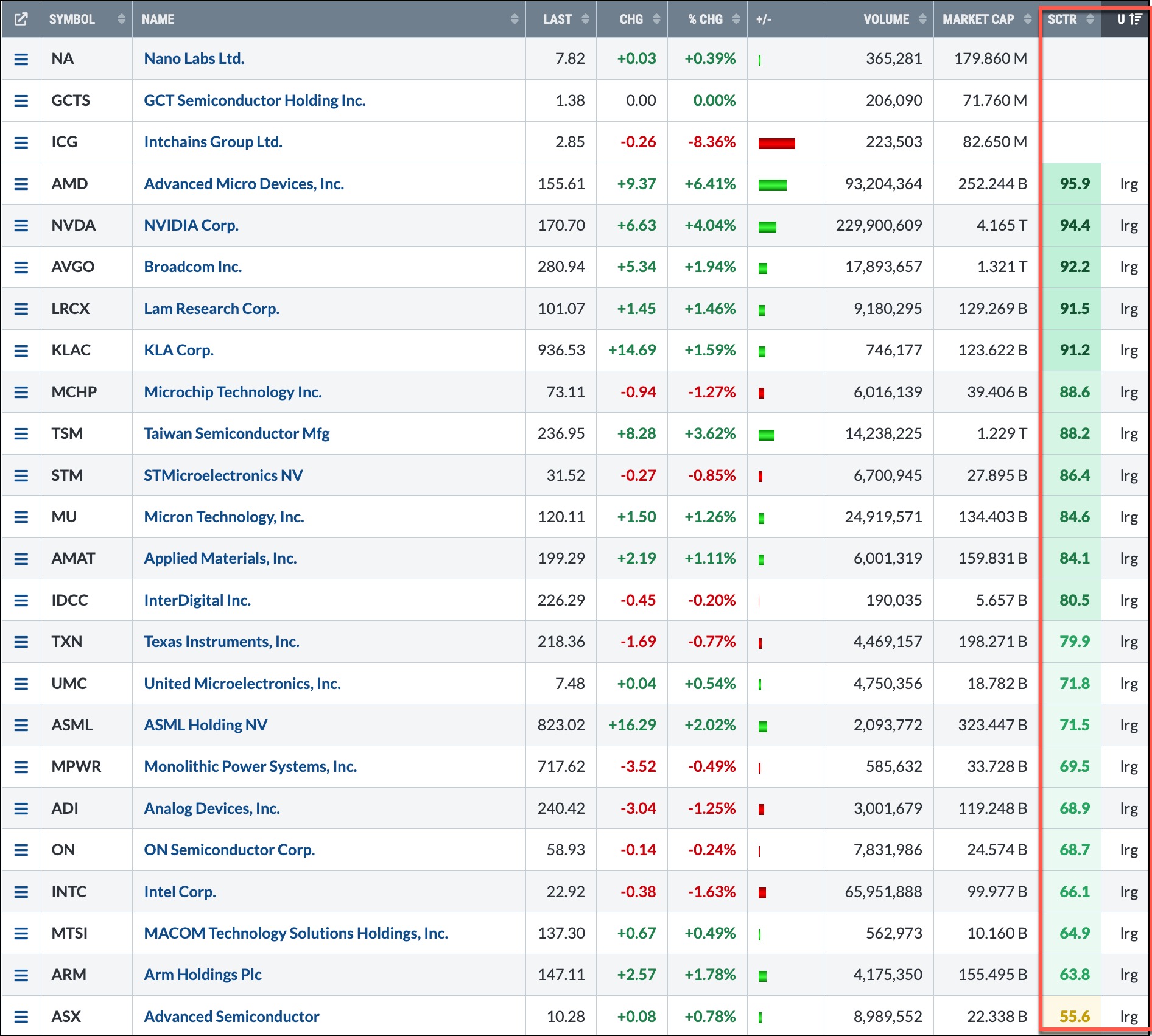
 One great habit to develop as an investor is regularly scanning the stock market. Whether you’re checking for stocks that are outperforming a benchmark,
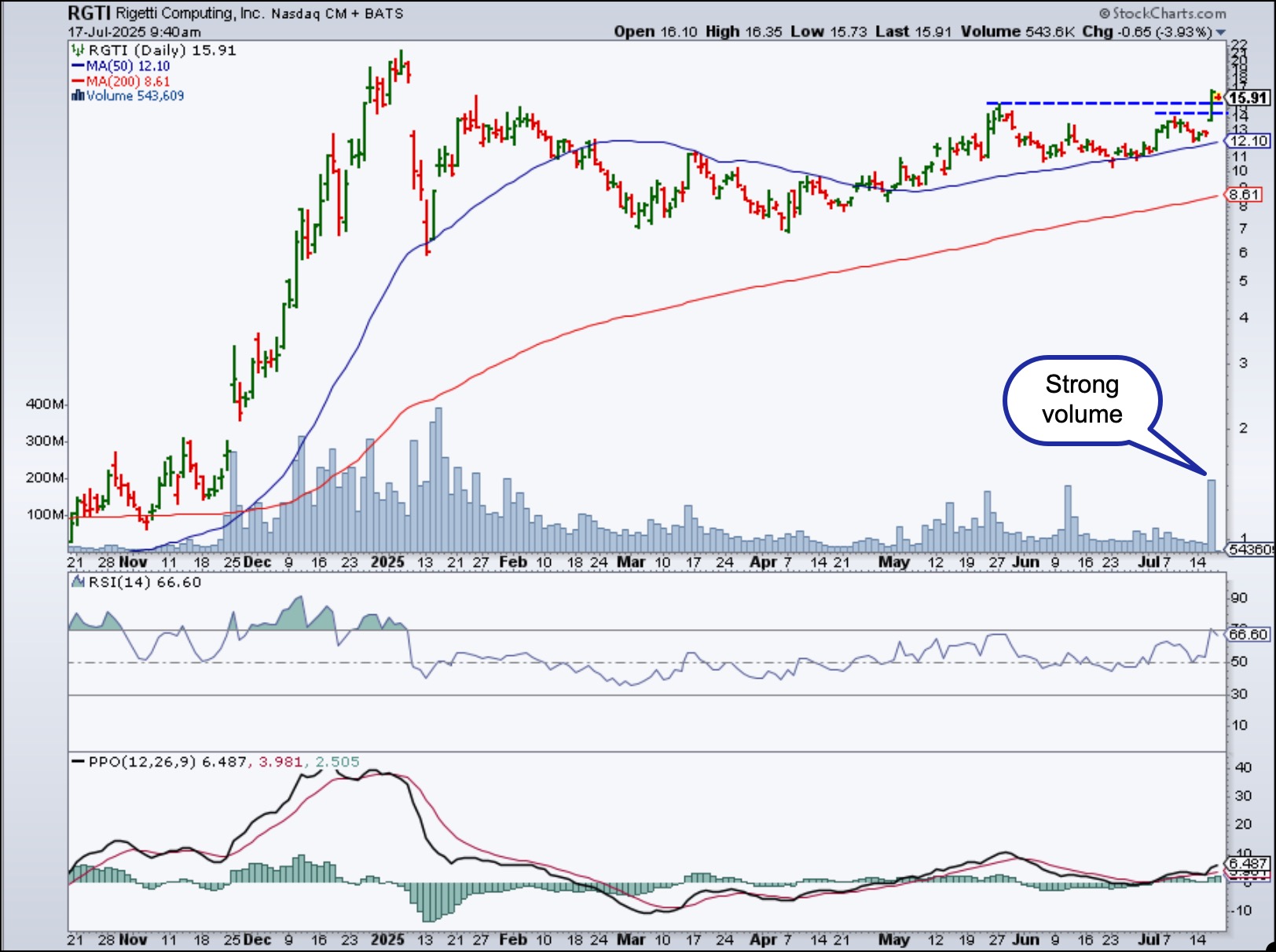


 Join Grayson as he shares how to streamline your analysis using custom ChartStyles. He demonstrates how to create one-click ChartStyles tailored to your favorite indicators, use style buttons to quickly switch between clean, focused views, and build a chart-leveling system that reduces noise and helps you stay locked in on what matters most.
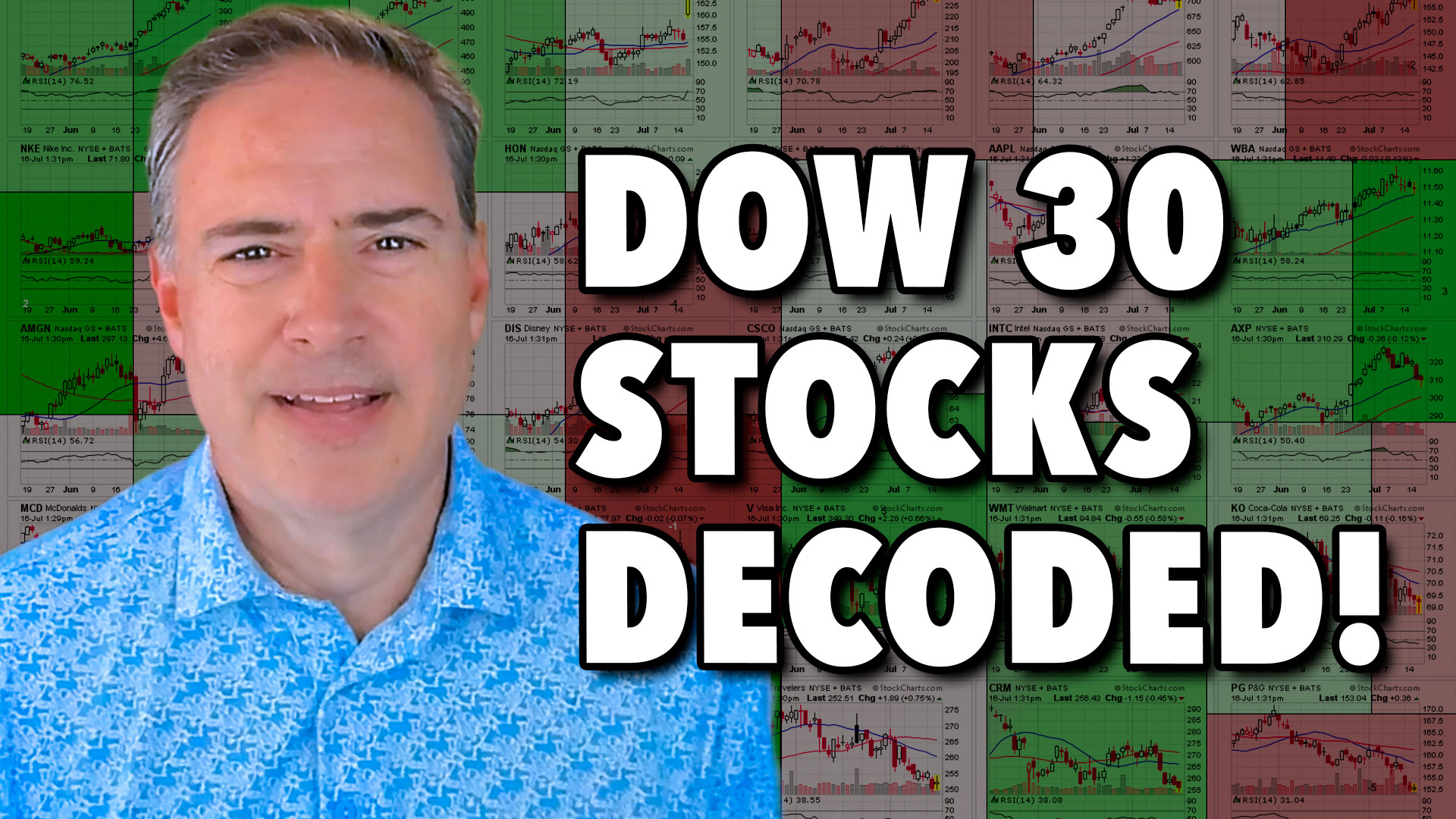 This week, Joe analyzes all 30 Dow Jones Industrial Average stocks in a rapid-fire format, offering key technical takeaways and highlighting potential setups in the process. Using his multi-timeframe momentum and trend approach, Joe shows how institutional investors assess relative strength, chart structure, ADX signals, and support zones. From Boeing’s triple bottom to Nvidia’s powerful trend, not to mention Microsoft’s key pullback level, this session is packed with insights for traders looking to stay in sync with the market’s leaders and laggards.
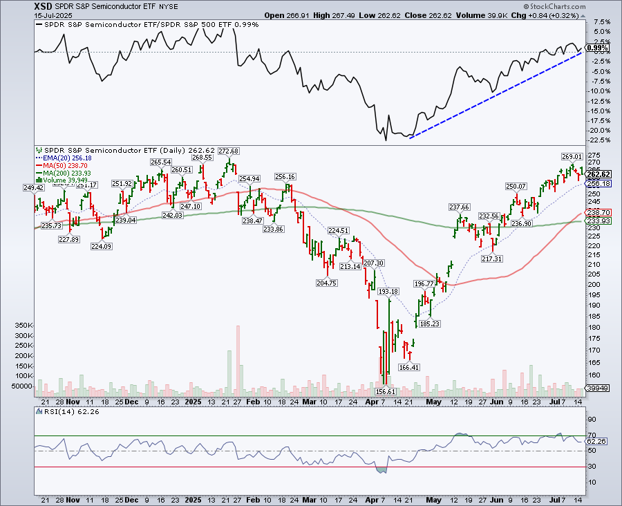
 From the S&P 500’s pause within a bullish trend, to critical support levels in semiconductors, plus bullish breakouts in Ethereum and Bitcoin, Frank highlights how the market’s recent consolidation may lead to major upside. In this video, Frank explores how to use StockCharts to layer chart annotations, trend indicators, and pattern analysis for stronger evidence-based decisions. He also compares current chart structures to 2020-2021 in order to better understand what could be next.
 Unlock the power of automated options trading with Tony Zhang, Chief Strategist at OptionsPlay. In this exclusive training, Tony reveals how the OptionsPlay Strategy Center, integrated with StockCharts.com, transforms the way traders find, analyze, and execute options strategies.


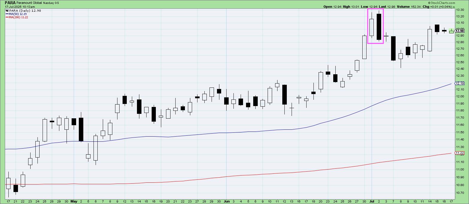
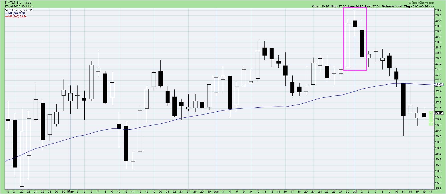
 Join Dave as he reviews three common candle patterns traders can use to identify potential turning points. From bullish engulfing patterns to evening star patterns, Dave gives insights on how to leverage these powerful candle signals to anticipate market shifts. He also shows combining candle patterns with conventional technical analysis tools can help improve success rates.