Category

Stock

Category

Catching a sector early as it rotates out of a slump is one of the more reliable ways to get ahead of an emerging trend. You just have to make sure the rotation has enough strength to follow through.

On Thursday morning, as the markets maintained a cautiously bullish tone, I checked the New Highs panel on the StockCharts Dashboard, scanning the 1-, 3-, 6-, and 9-month highs list. A clear theme emerged—biotech and healthcare stocks dominated the shorter-term highs.

Seeing strength in healthcare and biotech, I checked the Market Summary BPI panel to compare breadth across sectors. Healthcare posted a 63.93% reading—an early sign the sector may be turning higher.

Comparing the broader sector with the biotech industry, the Key Ratios – Offense vs. Defense panel showed that Biotech outperformed Healthcare by a modest 2.31% over the past three months. This panel compares the SPDR S&P Biotech ETF (XBI), which represents the biotech sector, with the broader Health Care Select Sector SPDR Fund (XLV).

Are Biotech and Healthcare Starting a Bullish Rotation?

So, are we seeing an early rotation of both industry and sector toward the upside, and could either be shaping up as an opportunity for investment? Let’s take a comparative look at both relative to the SPDR S&P 500 ETF (SPY), our broad market stand-in.

Comparing XBI and XLV to SPY: Signs of Leadership?

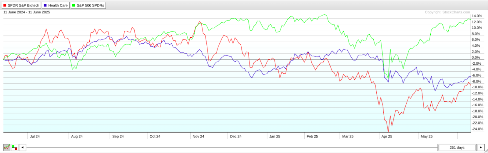
FIGURE 1. PERFCHARTS OF XBI, XLV, AND SPY. This is typical of what you’d see during an early-stage rotation.

This PerfCharts view shows a one-year snapshot of relative performance, with biotech lagging behind healthcare, and both trailing the SPY in negative territory. Yet XBI and XLV are showing signs of recovery, with XBI exhibiting a sharper angle of ascent.

Seasonal Strength in Healthcare and Biotech Stocks

Now here’s an interesting addition to the current analysis: what if we considered the industry and the sector from a seasonality perspective? The reason for this is that certain sectors and the industries within them tend to exhibit recurring patterns of strength or weakness during specific times of the year. If we’re seeing a potential turning point in either, could a seasonality lens offer additional insight or clarity to the analysis?

Biotech Seasonality: Strong Months for XBI

Let’s start with XBI, and notice how it’s now entering a cluster of seasonally-favorable months.

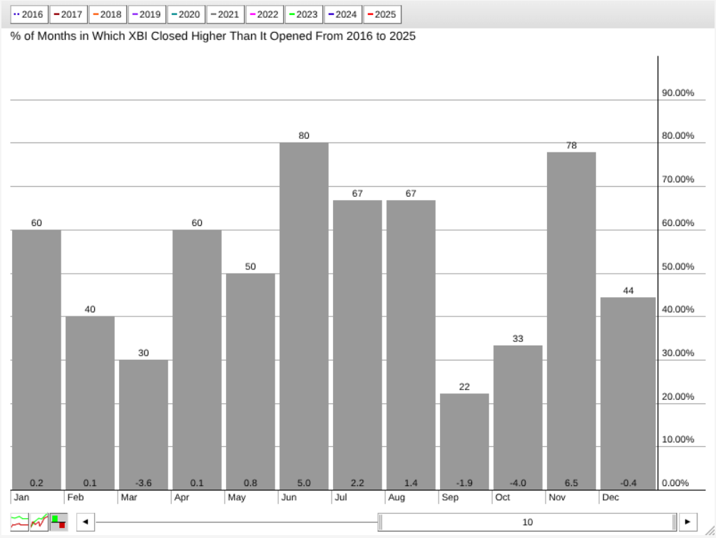
FIGURE 2. SEASONALITY CHART OF XBI. The industry is entering a cluster of seasonally strong months.

According to this 10-year seasonality chart, June, July, August, and November tend to be strong months for XBI, with positive closing rates well above 50% (see figures above each bar) and higher-than-average returns (see figures at the bottom of the bars). Among them, June and November stand out as XBI’s strongest seasonal months.

XLV Seasonality: November Still Reigns

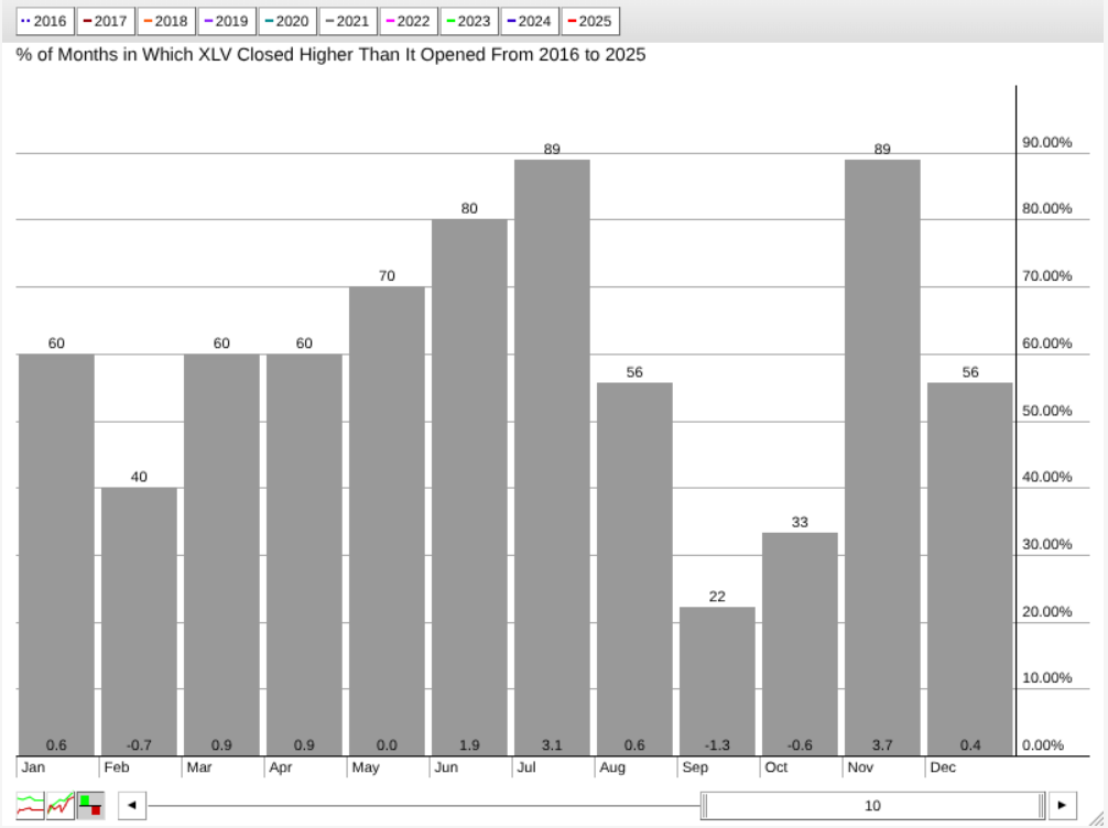
FIGURE 3. SEASONALITY CHART OF XLV.  According to this, July is XLV’s second-strongest month after November.

XLV’s seasonal profile shares a similar pattern, with a few key differences. July emerges as XLV’s second-strongest month, boasting a close rate of 89% and an average return of 3.1%. Like XBI, November is XLV’s top month in terms of average return.

What this tells us is that the biotech industry and the broader healthcare sector have historically performed well during these periods (especially November), suggesting that seasonal strength could serve as a tailwind if the current rotation continues to build momentum.

Charting the Rotation: XBI Trend Structure Shows Some Clarity

Next, let’s take a look at their current price action, starting with a daily chart of XBI.

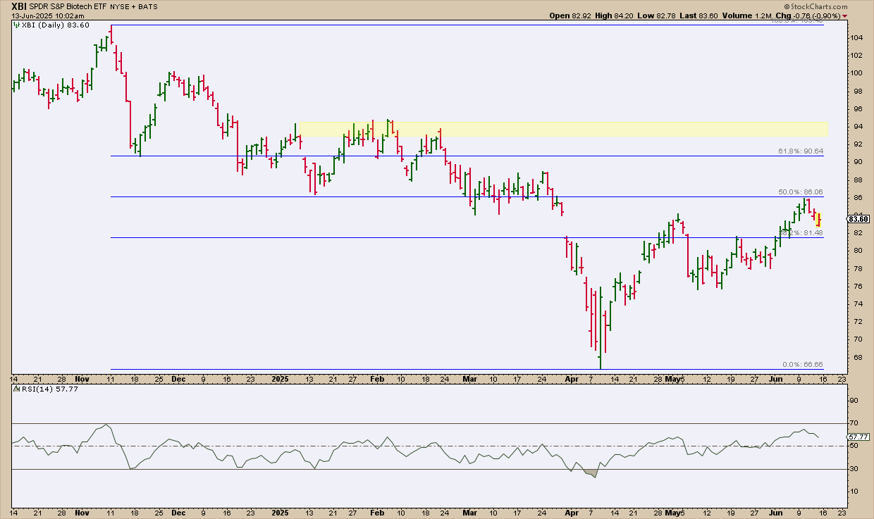
FIGURE 4. DAILY CHART OF XBI. Notice how the trend structure is well-defined by the Fibonacci retracement, providing clear measurements for you to gauge the subsequent directionality once the market decides which way XBI will go.

XBI’s price action shows it reversed at the 50% Fibonacci Retracement level (November high to April low). Will the bears take control, or will XBI’s near-term reaction strengthen into an uptrend, eventually pushing XBI past the 61.8% retracement level, a threshold wherein bears may fold their positions and bulls increase theirs?

In light of the latter, the Relative Strength Index (RSI) is at 61 and rising, indicating room for upside, but only under the condition that the current bullish swing maintains its trajectory.

A few actionable tips. If you’re bullish on XBI and planning to add it to your portfolio, consider the following:

  • If XBI were to pull back deeper, watch to see if it bounces near the last recent swing low area at $76.
  • If XBI reverses to the upside, expect resistance at the 61.8% Fib retracement at around $91. Also, watch the yellow-shaded zone around $94, an area of concentrated trading activity which may also act as a strong resistance zone.

If XBI rotates in a bullish fashion, these key levels can help guide your analysis.

XLV Technical Setup: Strength, But Not Yet a Breakout

Next, shift over to a daily chart of XLV. You’ll notice it’s quite different despite also exhibiting a recovery.

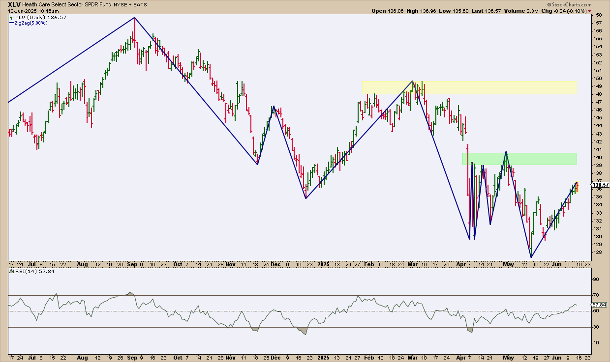
FIGURE 5. DAILY CHART OF XLV. Unlike the previous example, XLV’s price action is more muddled.

XLV’s recovery doesn’t appear as convincing just yet, as it still needs to clear multiple swing highs and resistance levels clustered between $139 and $141 (highlighted in green). If it manages to break above this zone, the next resistance range—shaded in yellow—sits between $148 and $150. In short, the sector proxy faces several hurdles and technical headwinds ahead.

The RSI, at 58 and rising, is nowhere near overbought territory, but it may not immediately indicate bullishness unless XLV is able to establish an uptrend. For now, it isn’t clear if that will happen, so exercise caution.

From an actionable standpoint, the current technical structure doesn’t offer a clear entry setup. That’s largely because the trend lacks a well-defined sequence of higher swing highs and higher swing lows—something you’d typically look for when establishing favorable entry and exit positions.

At the Close

If healthcare and biotech are starting to rotate higher, XBI and XLV are the charts to watch. XBI shows a stronger trend structure, while XLV still faces resistance.  With seasonality on their side, add them to your ChartLists to track key levels and price action.


Disclaimer: This blog is for educational purposes only and should not be construed as financial advice. The ideas and strategies should never be used without first assessing your own personal and financial situation, or without consulting a financial professional.

Three sectors stand out, with one sporting a recent breakout that argues for higher prices. Today’s report will highlight three criteria to define a leading uptrend. First, price should be above the rising 200-day SMA. Second, the price-relative should be above its rising 200-day SMA. And finally, leaders should trade at or near 52-week highs. Let’s compare the Utilities SPDR (XLU) to see how it stacks up.

The CandleGlance charts below show the top five sectors and SPY. I am ranking performance using Fast Stochastics (255,1). Stochastic values reflect the level of the close relative to the high-low range over the given period. 255 trading days is around 1 year. An ETF is at a 52-week high when the value is above 99 (XLK) and an ETF is near a new high with a value above 90 (XLU). The CandleGlance charts show XLK, XLI and XLU with values above 90, which means the are near new highs.

***********************

TrendInvestorPro is following the breakout in XLU, the bull flag in GLD, a small wedge in AMLP, a breakout in XLP and more. We also covered trailing stop alternatives for the pennant breakouts in some key tech related ETFs. Click here to learn more and gain immediate access.

***********************

Now let’s turn to price action. XLU is trading above its rising 200-day SMA. Thus, the long-term trend is up. XLU also broke falling channel resistance in early May. The pink lines show a falling channel that retraced around 61.8% of the July-December advance (23.6%). Both the pattern and the retracement amount are typical for corrections within a bigger uptrend. The early May breakout signals a continuation of the long-term uptrend and new highs are expected. The May lows mark first support at 78. A close below this level would warrant a re-evaluation.

And finally, let’s measure relative performance using the price-relative (XLU/RSP ratio). The lower window shows the price-relative in an uptrend for over a year and above its 200-day SMA since early March. This shows long-term relative strength. The pink trendlines show relative performance corrections when XLU underperformed for short periods. XLU is currently experiencing an underperformance correction because the broader market surge from early April to early June.

TrendInvestorPro is following the breakout in XLU, the bull flag in GLD, a small wedge in AMLP, a breakout in XLP and more. We also covered trailing stop alternatives for the pennant breakouts in some key tech related ETFs. Click here to learn more and gain immediate access.

//////////////////////////////////////////////////

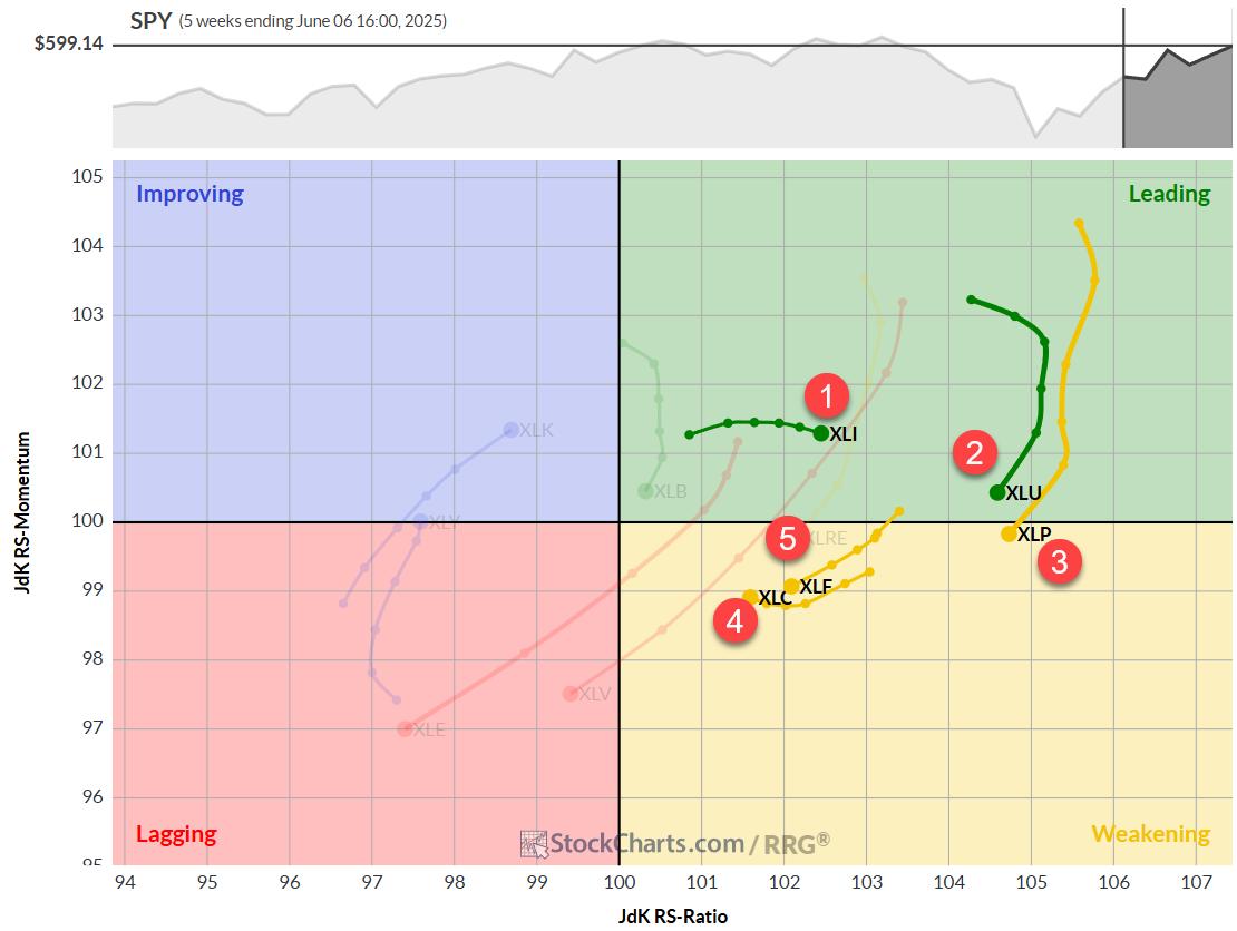
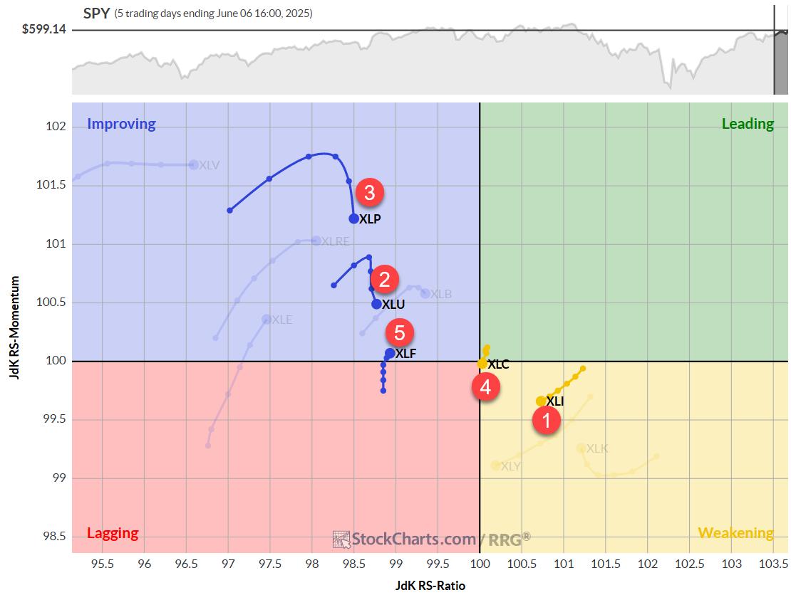
This week, Julius shows how the Technology sector is edging toward leadership, alongside Industrials and soon-to-follow Communication Services. He highlights breakout lines for SPY, XLK, and XLC, noting that conviction climbs when daily and weekly RRG tails align to point northeast together. Bitcoin is sprinting into the leading quadrant next to a reinvigorated SPY, while bonds, commodities, and a weakening U.S. Dollar drift into lagging territory, underscoring an equity-friendly backdrop.

This video was originally published on June 12, 2025. Click on the icon above to view on our dedicated page for Julius.

Past videos from Julius can be found here.

#StayAlert, -Julius

While the S&P 500 ($SPX) logged a negative reversal on Wednesday, the Cboe Volatility Index ($VIX), Wall Street’s fear gauge, logged a positive reversal. This is pretty typical: when the S&P 500 falls, the VIX rises.

Here’s what makes it interesting: the VIX has quietly crept up in three of the last four days. Before the midday pivot, the VIX hit its lowest level since February 21, 2025. And while that wasn’t the low in February, it was close. As the chart below depicts, back then, the VIX’s intraday low occurred on February 14, 2025, a few days before the SPX topped on February 19.

It wasn’t a screaming sell signal for equities. The S&P 500 was set to follow through on the big cup-with-handle pattern breakout, even though two straight bullish patterns failed in December and January.

Ultimately, the combination of the S&P 500 failing to get much higher than 6,100 and the VIX bouncing near support set the stage for the market rolling over. It was, of course, news-induced, but the market’s character had been changing since December, when breadth first took a major hit.

So, with the VIX closer to that same support zone now than it has been at any time the last few months and the S&P 500 back above 6,000, the pendulum has swung back near the extreme levels where the fireworks began. But there are two major differences now vs. then.

Bullish Patterns Are Working

Bullish patterns weren’t holding up well in December, January, and February (and then again in March). But they are working now.

Let’s not take this for granted. The S&P 500 starts the day with three live bullish patterns, and the index already hit one upside objective (5,840).

Most importantly, the index has extended above the breakout zones of the two biggest ones by 5.4% and 9%, respectively (see charts below). This means it could endure a not-so-small drawdown, and the patterns (and their upside targets) would remain in place. The index had no such cushion in February.

Still No 1% Declines

Since April 21, the S&P 500 has logged just one 1% decline, which now spans 35 trading days. It had 20 over the prior 71 days since January 6, 2025. That’s a rate of 2.8% vs. 28%. We had literally 10 times more 1% declines from January to April 21.

We didn’t see too many 1% losses in the first few weeks of 2025 either (see chart below). But with the index continuously failing at resistance, it just couldn’t leverage the low-volatility environment like it did from late 2023 through late 2024. As described above, in the last two months, the S&P 500 has been capitalizing on breakouts on low two-way volatility.

So, could all of this completely flip again with a massively surprising “unknown unknown” headline? There’s always that risk. And we know about the big collection of sell signals out there (MACD and Demark).

All of this suggests a respite is due. Bulls and bears seem to agree about that. What they don’t agree upon is the severity of that next pullback. There’s no use in trying to predict how far or how damaging it will be, however. As long as the bullish patterns remain intact, the nascent uptrend has a chance to continue in the months to come.

Zooming In: ARKK’s Strong Run

Let’s take a closer look at one of the more popular growth-focused ETFs: ARK Innovation ETF (ARKK). Despite finishing off its highs, ARKK logged its fourth straight gain yesterday and is now up eight of the last nine trading sessions. Over that time, it has fully leveraged the bull flag we mentioned two weeks ago. The target from that pattern is near $67.

ARKK also logged its third straight trading box breakout in the last few days. So, from a short-term pattern perspective, things have continued to work for the stock.

Indicator-wise, ARKK is now officially overbought for the first time since last December. Over the last year, here’s how the ETF has fared after first reaching overbought territory.

Last July, ARKK hit its summer top just a few days after becoming overbought. In November and December (while ARKK’s upswing continued through mid-February), the ETF pulled back to levels below where the relative strength index (RSI) first hit 70 over the ensuing days/weeks both times.

In other words, this is not the best trading setup for new short-term longs. We expect the risk-reward to improve after the next pullback.

ARKK is also approaching the upper threshold of its big two-year trading channel, which could slow things down soon.

The Bottom Line

The S&P 500 is rising slowly and steadily, volatility is still relatively low, and growth plays like ARKK are looking strong, although they may be due for a pullback in the near term. Keep an eye on the chart patterns that are forming and look for investment opportunities on pullbacks.


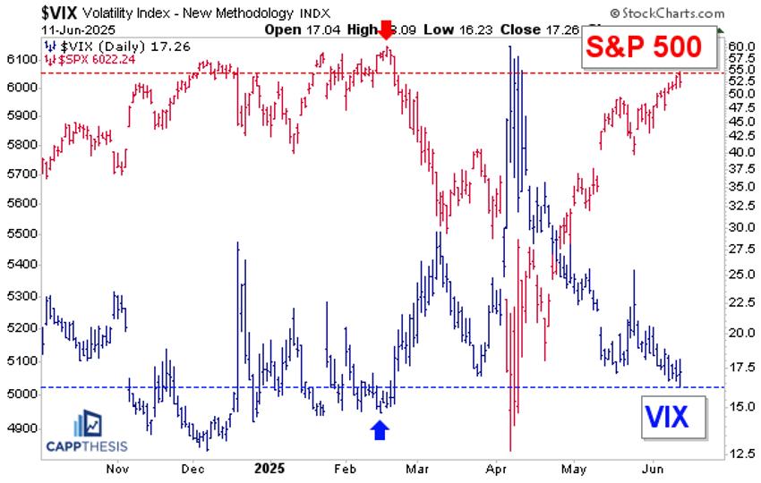
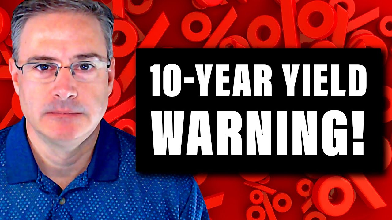
Joe kicks off this week’s video with a multi‑timeframe deep dive into the 10‑year U.S. Treasury yield (TNX), explaining why a sideways coil just below the 5% level could be “downright scary” for equities. From there, he demonstrates precise entry/exit timingwith a combination of ADX, MACD, and RSI. Joe also covers the short-term divergence developing in the QQQ, takes a look at the IWM, and wraps up with some analyses of this week’s viewer symbol requests, including INTC, MU, and more.

The video premiered on June 11, 2025. Click this link to watch on Joe’s dedicated page.

Archived videos from Joe are available at this link. Send symbol requests to stocktalk@stockcharts.com; you can also submit a request in the comments section below the video on YouTube. Symbol Requests can be sent in throughout the week prior to the next show.

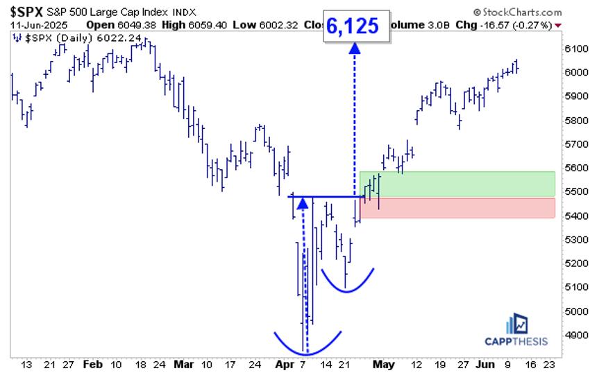
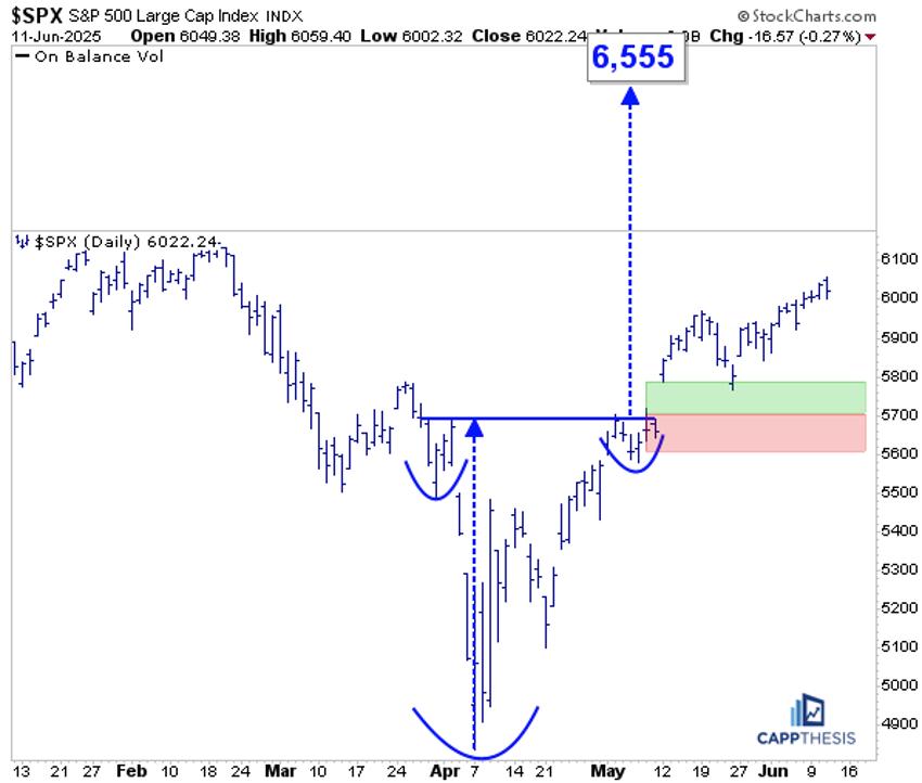
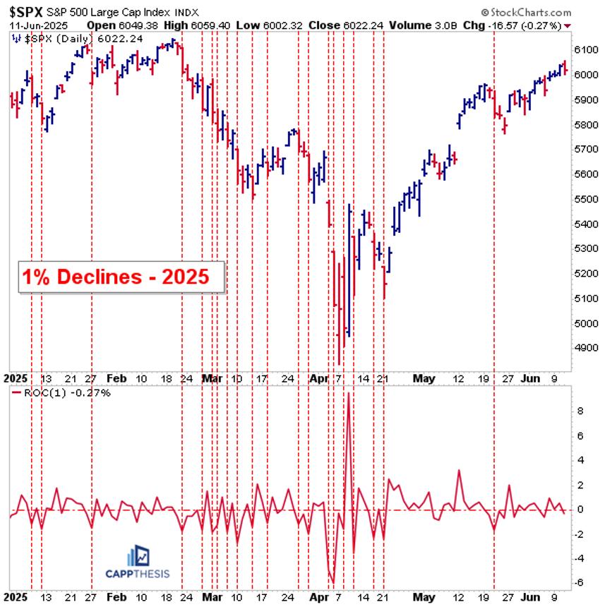
The U.S. stock market has been painting a subtle picture recently. While the broader indexes, such as the S&P 500 ($SPX), Nasdaq Composite ($COMPQ), and Dow Jones Industrial Average ($INDU), are indeed grinding higher, the daily movements have been relatively subdued. This is a noticeable shift from the more dynamic action we observed in April.

Investors may be waiting for Wednesday’s May Consumer Price Index (CPI), the results of the U.S.-China trade talks, or the next market-moving news headline. What’s encouraging is the underlying strength in market breadth. We’re seeing a healthy number of one-month new highs across most broader indexes (with the exception of Dow Utilities), Bullish Percent Indexes signaling bullish tendencies, and investors gravitating toward offensive sectors vs. defensive ones.

On the surface, everything points to a continuation of the bullish trend. However, as astute investors, our primary objective is to protect our capital. This means we mus always consider the possibility of a downside correction and be prepared to adapt.

This is where the StockCharts Market Summary page becomes an indispensable tool for your market analysis.

Let’s dive into how the Market Summary page can help you gain a unique perspective on market dynamics.

Beyond the Headlines: Uncovering Global Trends

One of the powerful features of the Market Summary page is its ability to provide a global snapshot. If you navigate to the Global Snapshot tab in the Equities panel and sort the “+/- SMA(200)” column in descending order, you’ll notice something fascinating: the Eurozone occupies the top spot while the Total US sits at the bottom (see image below).

FIGURE 1. A GLOBAL SNAPSHOT. The Eurozone is trading well above its 200-day simple moving average (SMA) while the Total US is only 4.37% above its 200-day SMA.Image source: StockCharts.com. For educational purposes.

This insightful view suggests that global markets have been trending well above their 200-day simple moving average than the US market. This insight is worth a deeper dive.

Consider the daily charts of the iShares MSCI Eurozone ETF (EZU) and Vanguard Total Stock Market ETF (VTI) which serve as proxies for these regions.

Since April 8, EZU has been on a steep ascent, demonstrating upward momentum. This price action is similar to the S&P 500, but if you consider the relative performance of the SPDR S&P 500 (SPY) vs. EZU, SPY is underperforming EZU (see bottom panel in the chart below).

FIGURE 2. DAILY CHART OF EZU. The ETF is exhibiting a steep ascent and is outperforming SPY. Will the trend become less steep or continue its steep uptrend? Be sure to monitor the RSI.Chart source: StockCharts.com. For educational purposes.

The Relative Strength Index (RSI) is showing lackluster momentum. Generally, a steep trend loses its mojo after a while and reverts to a more normal trend.

Meanwhile, though VTI has also moved higher, its percentage rise was slightly less than EZU. Also, as EZU hit an all-time high, VTI is still trying to reach that milestone (see chart below).

FIGURE 3. DAILY CHART OF VTI. The ETF is also exhibiting a steep ascent but is trying hard to reach its all-time high.Chart source: StockCharts.com. For educational purposes.

The RSI is showing lackluster momentum, similar to that of EZU, which could mean the steep ascent may be losing its steam.

Identifying Global Opportunities

It will be interesting to see how the global financial market evolves from here. Who will be the first to revert to a more normal sloping trend? Will EZU continue its outperformance, or will VTI take the lead?

And let’s not forget the global ETFs positioned in the middle of the pack. Regions like Asia (ex Japan), Latin America, or Emerging Markets could take the lead. For example, the Vanguard FTSE Emerging Markets ETF (VWO) has exhibited a more classic uptrend. Over the past year, it has outperformed SPY by around 127% (see chart below). The RSI is also showing greater momentum than the other charts we analyzed.

FIGURE 4. DAILY CHART OF VWO. This ETF is exhibiting a more normal uptrend and, over the last year, has outperformed SPY by a whopping 127%. RSI is also rising, suggesting there could be momentum here.Chart source: StockCharts.com. For educational purposes.

Empowering Your Stock Market Analysis

To stay ahead of market trends and uncover hidden gems, investors and traders should regularly monitor the charts in the Market Summary ChartLists. If you haven’t already, download the StockCharts Market Summary ChartPack (it’s free for subscribers).

Scrolling through the pre-built ChartLists will help you to:

  • Stay on top of the market’s price action across sectors, industries, and global regions.
  • Identify market internals, such as breadth and sentiment.
  • Uncover some hidden gems that could translate into favorable investment opportunities.


Disclaimer: This blog is for educational purposes only and should not be construed as financial advice. The ideas and strategies should never be used without first assessing your own personal and financial situation, or without consulting a financial professional.

Unlock the power of divergence analysis! Join Dave as he breaks down what a bearish momentum divergence is and why it matters. Throughout this video, Dave illustrates how to confirm (or invalidate) the signal on the S&P500, Nasdaq100, equal‑weighted indexes, semiconductors, and even defensive names like AT&T (T).

This video originally premiered on June 10, 2025. Watch on StockCharts’ dedicated David Keller page!

Previously recorded videos from Dave are available at this link.

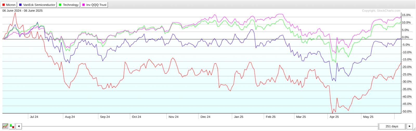
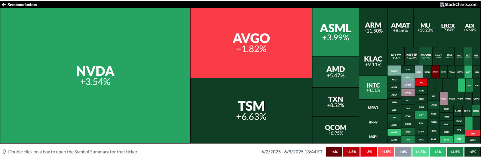
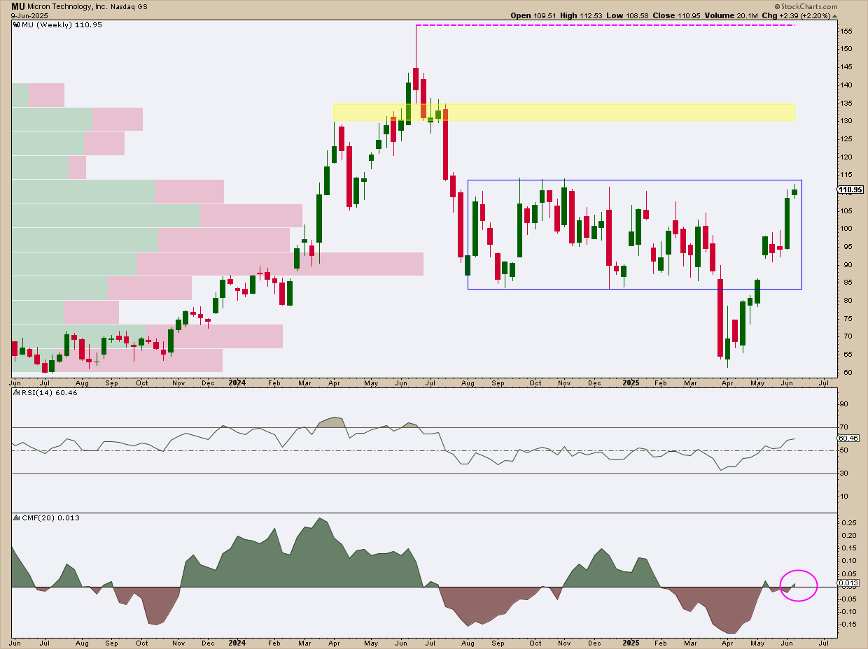
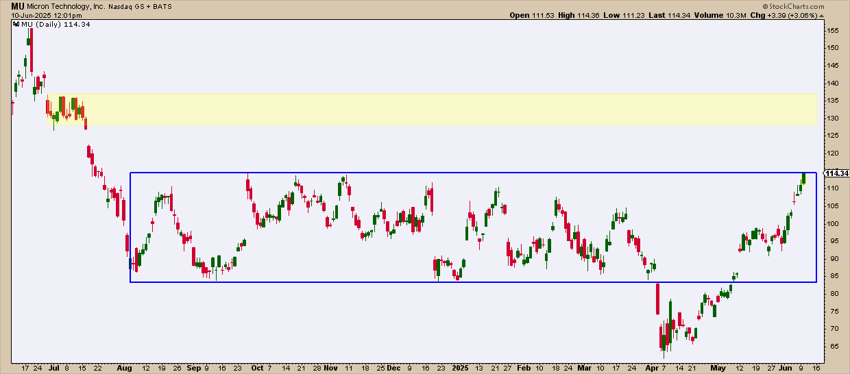
Micron Technology, Inc. (MU) appears poised for an explosive breakout, both technically and fundamentally. While it remains to be seen whether this materializes by its Q3 earnings report on June 25, the setup suggests a high-probability move is about to happen, and soon.

The fundamental case for a breakout is backed by MU’s deep involvement in the AI memory boom. Its high-bandwidth memory (HBM) is powering Nvidia’s next-gen Blackwell chips, demand is outstripping supply, and prices are rising. With sold-out capacity for 2025 and earnings projected to surge 437% this year, MU’s Q3 report could be the next major catalyst.

In light of these forecasts, let’s put things into context and see where MU has stood over the past year in its comparative performance with VanEck Vectors Semiconductor ETF (SMH), our semiconductor industry proxy, Technology Select Sector SPDR Fund (XLK), for a sector comparison, and Invesco QQQ Trust (QQQ), a stand-in for the Nasdaq 100 Index ($NDX).

MU vs. SMH, XLK, and QQQ: Tracking Relative Performance

Despite its recent rally, MU remains a relative laggard. Whether it breaks out will depend on how effectively it positions itself amid shifting industry dynamics.

FIGURE 1. PERFCHARTS OF MU RELATIVE TO ITS INDUSTRY, SECTOR, AND THE NASDAQ 100.  MU has been the big laggard over the past year. You need to take a closer and more detailed look to gain more insight into MU’s current upward momentum.

While analysts are optimistic about its role in the evolving AI-driven landscape, that thesis will be put to the test when the company reports earnings in the coming weeks.

A Shift in Momentum? What the MarketCarpets Are Revealing

While MU lags its industry peers, it might help you to get a more granular view of performance within the semiconductor industry. This is where the StockCharts MarketCarpets Semiconductors summary can be helpful.

FIGURE 2. MARKETCARPETS – SEMICONDUCTORS. In contrast to its peers, a 5-day view shows that MU is the strongest performer.

Though MU has trailed its industry peers over the past year, the 5-day MarketCarpets view reveals a shift in momentum. With a 13.32% gain over the past week, MU is rapidly narrowing the gap and beginning to outpace its peers.

Weekly Chart Levels: Resistance, Support, and Entry Zones

Typically, you’d drill down to a daily chart for more precision, but, with MU, the weekly chart alone highlights the key levels worth watching.

FIGURE 3. WEEKLY CHART OF MU. The weekly chart shows all key levels, from entry to profit targets and stop loss levels.

The weekly chart view clearly outlines support, resistance, and potential entry and exit points. Listed below are the key levels and scenarios to watch.

MU Price Scenarios: Breakout or Breakdown?

  • Watch the rectangle formation: MU is approaching a breakout above key resistance at $115, just ahead of its June 25 earnings report. A decisive move above the rectangle could trigger long entries from bullish traders.
  • Upside scenario: A beat on earnings and strong forward guidance could fuel continued upside—unless derailed by broader geopolitical risks.
  • Downside scenario: If the breakout fails, look for support near the bottom of the formation. The Volume-by-Price indicator shows a heavy concentration of trading at that level, reinforcing its significance as a support zone. However, a breakdown there may cast doubt on the current uptrend thesis.
  • Profit-taking zone: If MU continues its bullish trajectory, expect resistance and likely profit-taking between $127 and $137, an area marked by multiple highs and consolidation levels throughout 2024.

Why $127 to $137, when the weekly chart shows $130 to $135? Here’s where zooming in helps.

FIGURE 4. ZOOMING N TO A DAILY CHART OF MU. This shows, in much greater detail, the potential resistance levels above.

The top and bottom of this consolidation provide a clearer view of potential resistance, which may also serve as profit-taking levels for short-term traders, so keep an eye on this.

  • Last thing – watch the peak: A second round of resistance and potential profit-taking may occur near $155, a key level that previously marked the stock’s all-time high.

Momentum-wise—and note we’re looking at a longer-term time frame—the Relative Strength Index (RSI) suggests there’s still plenty of room to run before MU enters overbought territory. Volume-wise, however, you will want to see the Chaikin Money Flow (CMF) levels increase once the breakout occurs, confirming that buying pressure is supporting the move.

Quick Take: The Setup at a Glance

In a nutshell: Watch for a breakout above $115 ahead of MU’s June 25 earnings by setting an alert using the Technical Alert Workbench. Note that entering a position ahead of earnings is always a risky prospect. If you are planning to take any action at all, make sure it’s in alignment with your own personal trading strategy and criteria.

A beat on earnings and strong guidance could fuel further upside, but watch out! If Wall Street decides to “sell the news,” due to any detail that dampens investor or analyst sentiment, a sharp decline could follow. If MU moves strongly to the upside, look for confirmation via rising CMF levels, which would signal real buying pressure.

If the breakout fails, key support lies near the bottom of the current trading range. On the upside, expect potential resistance and profit-taking between $127–$137, with a secondary ceiling near $155. The RSI still shows room for further gains before MU becomes overbought.

Final Thoughts: Will MU Deliver on the AI Hype?

MU may be lagging now, but, as the MarketCarpets data shows, momentum is quietly shifting, and the shift may accelerate as MU approaches both a potential breakout level and its earnings date. With a critical breakout level in sight and earnings just days away, consider preparing for a potential surge in volatility, which could move the stock in either direction. If MU does break to the upside, whether it can maintain its momentum post-breakout will depend on volume, CMF strength, and how convincingly MU rides the AI memory wave.


Disclaimer: This blog is for educational purposes only and should not be construed as financial advice. The ideas and strategies should never be used without first assessing your own personal and financial situation, or without consulting a financial professional.

There are a few very different setups unfolding this week, which are worth a closer look. Two software-related names that are struggling to reclaim their winning ways. And one lovable and reliable stock is wagging its tail in the spotlight. 

Let’s break it down. 

Adobe (ADBE): Mind the Gaps

Adobe Systems, Inc. (ADBE) has been a heartbreaker for investors over the last several years. ADBE stock has traded lower after six of its last seven quarterly reports. That includes consecutive losses of nearly -14%. 

So what should investors be watching this time around?

Coming into Thursday’s release, shares are lower by 6.4% for the year and have just made back their losses from last quarter. Overall shares remain -35% from all-time highs set back in January 2024.

Investors will be looking for progress on the AI monetization front. Is annual recurring revenue from its Firefly and Acrobat products showing a strong growth projection? And perhaps more importantly, what’s the guidance going to look like? Last quarter, Adobe issued conservative guidance, and shareholders were punished as a result. Will forward-looking guidance meet investor expectations? 

Technically, ADBE shares are trying to find that bottom (see chart below). Progress has been made as the stock is taking minor steps to climb back from the morass. 

FIGURE 1. DAILY CHART OF ADBE STOCK. The stock is trading between the 100- and 200-day moving averages. The stock price could gain momentum and move higher or lower after earnings. Chart source: StockCharts.com. For educational purposes.

On the chart, we’re seeing the following signs:

  • Shares have broken their intermediate downtrend.
  • Shares have recaptured the 50-day moving average.
  • They have almost filled the downward gap caused by last quarter’s results.
  • They have recaptured the 100-day moving average and held for now.

That said, there’s still work to be done, and knowing how this stock gaps in earnings means a move may be coming. 

Let’s examine those last three gaps. Each one has been negative, and each time, price action continued in the trend’s direction for several weeks before making a bottom and rallying back. 

The same thing happened on the last gap up. Momentum in the direction of the gap continued for weeks. So, it’s a good idea to watch those gaps. 

The stock is in a “no man’s land” between key moving averages. The longer-term trend remains down, and it may take a huge report to stay above the 200-day moving average on a rally. It’s one to avoid for now, but the short-term play after earnings may be to go with the momentum of any gap. 

Chewy (CHWY): Any New Tricks in Store?

Chewy Inc. (CHWY), the online retailer of pet food and pet-related products, broke out to new highs just last week ahead of this week’s earnings. Shares have been on a roll since their April 7 low, gaining over 60% in that time (see chart below).

FIGURE 2. DAILY CHART OF CHWY STOCK. The stock price has been in beast mode since early April, up more than 60%. With the stock in overbought territory, it could pull back to $44 or $40. Chart source: StockCharts.com. For educational purposes.

Technically, the stock broke out of a textbook rounded bottom base and zoomed to its anticipated upside target of $50. 

CHWY shares seem overextended as they have been overbought for weeks (Relative Strength Index > 80). The stock price could roll over even on good news, given its recent run. Long-term investors may want to stay in the name and sit on gains. 

For those begging for a pullback, there are nice levels of support at $44 and ultimately at $40 if earnings bite investors. This should be a good opportunity to consider this name for your portfolio as the long-term technicals look great, and the company is known for its loyal user base. 

Oracle (ORCL): Time to Flip the Script?

Oracle Corp. (ORCL) will report earnings on Wednesday, looking to snap a two-quarter losing streak. 

Shares of the software giant have rallied nicely off their lows but are still -13% from their December peak. Investors would like to see its cloud revenue growth continue to expand thanks to agreements with OpenAI, Meta, and Nvidia. 

The one concern is the continued capital spending necessary to power the data centers required to meet AI demand. Are the company’s recent capital expenditures putting pressure on margins and impacting ORCL stock’s bottom line? 

Technically, shares have been on a nice run, eclipsing key levels to get back on track. Longer-term, the stock price started the week above its downtrend line, with respect to annual highs. 

FIGURE 3. DAILY CHART OF ORCL STOCK. From a technical perspective, the stock price has broken above a long-term downtrend. Will upside momentum continue after earnings? Keep an eye on this stock. Chart source: StockCharts.com. For educational purposes.

The rally looks similar to many other technology names that are trying to get back to their old highs. The good news is that, given the change in trajectory, even weakness looks to have a soft landing spot and good entry point from a risk/reward perspective. 

The stock reminds me of the S&P 500 ($SPX) a little bit — struggling to get to new highs and losing a bit of momentum. A pullback to its 200-day moving average around $163 would be a natural retracement — a flag if you will — and a good entry point on any drawdown after positive news. 

Any signs of strength and look for shares to run into the $190’s before stalling again. 

The Bottom Line

We’ve got three different stories unfolding:

  • ADBE’s stock needs to clear earnings hurdles and reclaim trust
  • CHWY’s stock is on fire, but might need to cool down
  • ORCL’s stock is rebuilding momentum and has potential upside if cloud numbers impress.

Sector Rotation: A Week of Stability Amidst Market Dynamics

Last week presented an intriguing scenario in our sector rotation portfolio.

For the first time in recent memory, we witnessed complete stability across all sector positions — no changes whatsoever in the rankings.

  1. (1) Industrials – (XLI)
  2. (2) Utilities – (XLU)
  3. (3) Consumer Staples – (XLP)
  4. (4) Communication Services – (XLC)
  5. (5) Financials – (XLF)
  6. (6) Technology – (XLK)
  7. (7) Real-Estate – (XLRE)
  8. (8) Materials – (XLB)
  9. (9) Consumer Discretionary – (XLY)
  10. (10) Healthcare – (XLV)
  11. (11) Energy – (XLE)

Weekly RRG: Steady as She Goes

The weekly Relative Rotation Graph (RRG) continues to paint a picture of gradual shifts. Utilities and Consumer Staples, while still occupying high RS ratio levels, are moving lower on the chart. Utilities clings to the leading quadrant, but Consumer Staples has just crossed into weakening territory.

Financials and Communication Services remain in the weakening quadrant, but their RS momentum levels have stabilized. Communication Services shows a slight uptick, while Financials maintains a negative heading — albeit well above the 100 mark.

Industrials, our current star performer, continues its reign in the leading quadrant. It’s gaining ground on the RS ratio axis while experiencing a minor dip in RS momentum. All in all, the weekly picture remains essentially unchanged from last week.

Daily RRG

Shifting our focus to the daily RRG, we start to see more nuanced movements:

  • Staples and Utilities are rotating within the improving quadrant, losing ground on the RS momentum axis without gaining in RS ratio. This suggests further weakening on the weekly chart is likely.
  • Financials have made their way into the improving quadrant — a positive development that builds on last week’s progress.
  • Communication Services is practically aligned with the benchmark (SPY), showing little distinctive movement.
  • Industrials continues deeper into the weakening quadrant, but — and this is crucial — its RRG velocity (the distance between tail nodes) is very low. This keeps the door open for a potential curl back up before hitting the lagging quadrant, which would reinforce its strong position.

Industrials: Breaking New Ground

The price chart for Industrials is confirming its current strength with a break above overhead resistance.

This breakthrough is likely to unlock more upside potential, keeping the sector firmly at the top of our list.

The relative performance continues to reflect this positive momentum.

Utilities: Struggling at Resistance

Once again, Utilities tested its overhead resistance (between 83 and 84) but failed to break higher.

Prices retreated into the range by week’s end. This setback is causing relative strength to drop back into its sideways trading range, with RRG lines rolling over.

The sector needs a swift improvement in both price and relative strength to maintain its recent strong position.

Consumer Staples: Déjà Vu

Consumer Staples finds itself in a similar boat to Utilities.

Another attempt to break overhead resistance around 83.5 was met with a pullback. This pattern has been repeating for weeks, and it’s taking its toll on the raw relative strength line.

While the RS ratio remains high — a legacy of strength since the year’s start — the rapid loss of relative momentum is causing the RS ratio to roll over.

Like Utilities, consumer staples need a quick price improvement to maintain its top-five position.

Communication Services: Closing In

Communication Services had a strong week, closing near the range’s high end and approaching its previous peak just above 105.

This improvement has kept the raw relative strength line against SPY within its rising channel.

Continued strength, especially if XLC breaks above 105, should keep relative strength in an uptrend and likely cause the RRG lines to curl back up soon.

Financials: Battling Resistance

Financials continue to struggle with its old rising support line, now acting as resistance near the 52 area where the previous high is located.

This price stagnation has caused the raw RS line to break its rising support, leading the RRG lines to roll over.

The RS momentum line has already dropped below 100, and the RS ratio is starting to move lower.

We’ve seen the daily tail for XLF pick up slightly — this acceleration needs to continue in the coming weeks for XLF to maintain its top-five position.

Portfolio Performance

Due to the positions of Consumer Staples and Utilities, our top five remains defensively positioned. This has caused our underperformance versus SPY to widen slightly — we’re now just over 6% behind since the start of the year.

Is this ideal? Of course not. But here’s the thing — trend-following systems need time to play out. The worst thing you can do is abandon a strategy just because it’s going against you for a few months. (And let’s be honest, it’s only been since May — so two months.)

I will stay the course, maintain discipline, and continue to track this portfolio based on our established metrics.

It’ll be interesting to see how long it takes for this strategy to come back on top and start outperforming SPY again. Patience is key in these situations.

#StayAlert and have a great wee. –Julius