I’m a huge fan of using platforms like StockCharts to help make my investment process more efficient and more effective. The StockCharts scan engine helps me identify stocks that are demonstrating constructive technical configuration based on the shape and relationship of multiple moving averages.
Today I’ll share with you one of my favorite scans, called “Moving Averages in Correct Order”, and walk through three charts that highlight the benefits of identifying charts in primary uptrend phases.
Primary Uptrends Can Be Defined By Moving Averages
This scan, which StockCharts members can access in the Sample Scan Library, basically looks for three criteria to be met for any chart:
- 20-day EMA > 50-day SMA
- 50-day SMA > 100-day SMA
- 100-day SMA > 200-day SMA
The general approach here is to find charts where the short-term moving averages are above their longer-term counterparts. By making multiple comparisons, we can ensure a more consistent uptrend phase based on the recent price action.
Let’s review two charts that I feel are representative of the stocks that will tend to come up using this scanning approach.
You’ll Probably Find Two Types of Charts in the Results
The most common result will be a chart that is in a long-term primary uptrend, making consistently higher highs and higher lows. Netflix (NFLX) is a great example of this sort of “long and strong” price action.
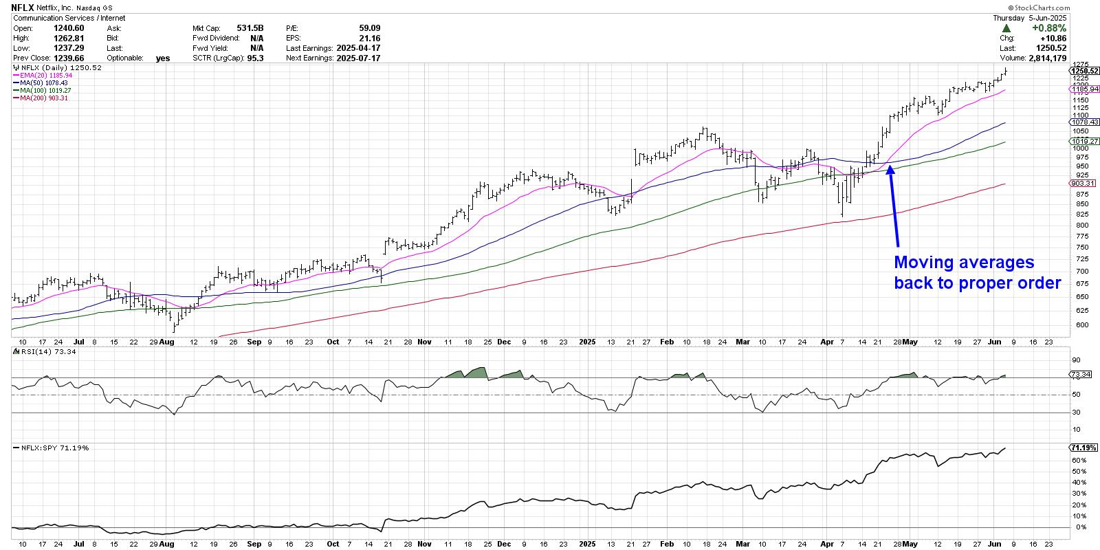
The four moving averages have remained in the proper order as described above for most of the last 12 months. After NFLX pulled back to its April low, a bounce back above the March swing high moved the 21-day exponential moving average back above the 50-day simple moving average. From that breakout point, the stock has continued to push to new all-time highs into early June.
One thing I love about this scan is it helps me confirm which stocks are in persistent uptrends, because those are the types of charts that I generally want to be following as they trend higher. But sometimes, a pullback chart will come up in the scan as well. Here’s TJX, which has recently pulled back after achieving a new all-time high in May.
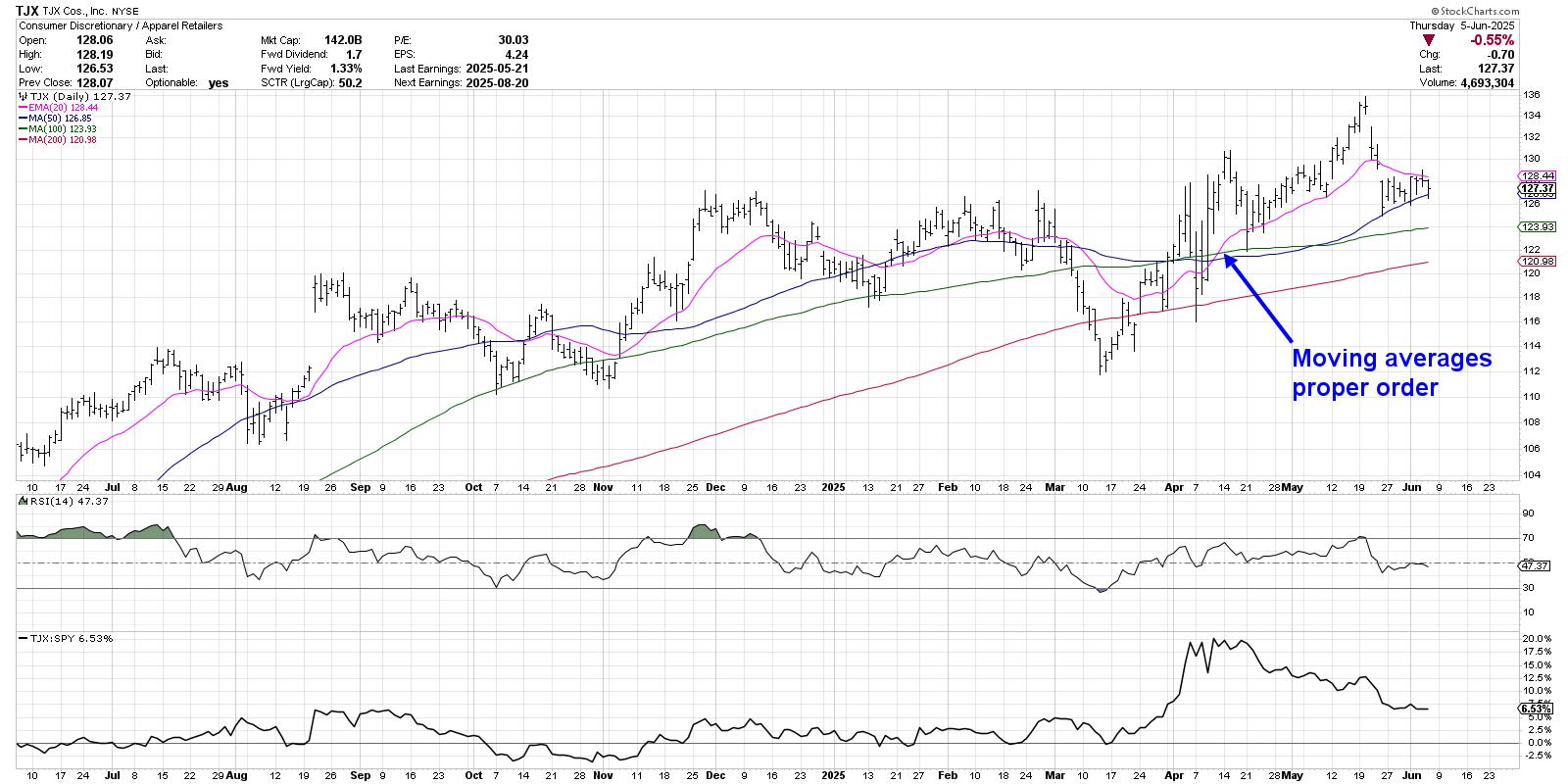
We can see that the moving averages returned to the proper order in early April after rotating higher off a major low in mid-March. From that point, TJX had a false breakout in mid-April before finally completing the move to a new high in early May. TJX subsequently gapped lower after an earnings miss, and the stock has now pulled back to an ascending 50-day moving average.
The TJX chart reminds me of three benefits of following moving averages over time. First, we can look at the slope of an individual moving average to evaluate the shape of the trend on a specific time frame. Second, we can compare multiple moving averages to validate the trend on multiple time frames. Finally, we can use moving averages as potential support and resistance levels in the event of a pullback.
With TJX testing an ascending 50-day moving average this week, I’m inclined to treat this chart as “innocent until proven guilty” as long as it remains above this key trend barometer. But if and when the 50-day moving average is violated, and if the moving averages are no longer in the proper order, then I would need to reevaluate a long position.
Why the Transition to Proper Order is So Important
This final example shows how the transition between moving average configurations can prove so valuable in understanding trend transitions. Here’s a daily chart of VeriSign (VRSN) showing how the relationship between the moving averages can help us better label the different trend phases.
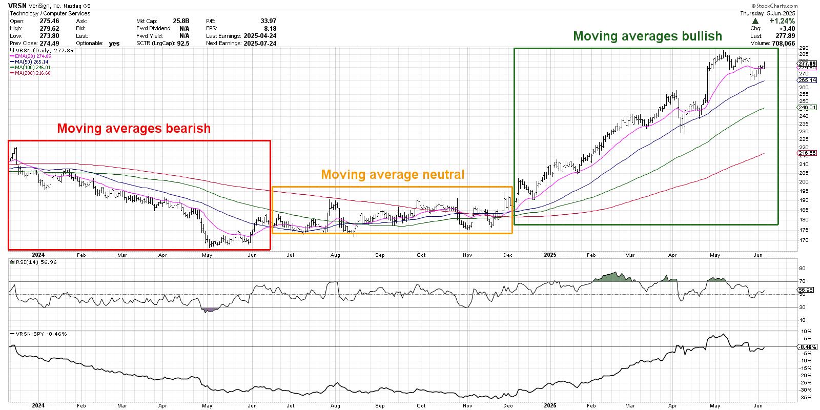
On the left third of the chart, we can see the moving averages mostly in a bearish order, confirming a distribution phase for the stock. Then in June 2024, the moving averages change to where there’s no real clean definition of the trend. This represents a consolidation phase, where buyers and sellers are essentially in agreement.
Finally, we can see that when the moving averages finally achieve a bullish configuration, VRSN is now in an accumulation phase of higher highs and higher lows. And as long as those moving averages remain in the proper order, the uptrend phase is confirmed.
The goal with this moving average scan is to help us identify charts that are just rotating into the accumulation phase. It’s also designed to encourage us to stick with winning trends as long as the price action confirms the uptrend. And if and when the moving average configuration changes, then our approach should probably change as well!
RR#6,
Dave
PS- Ready to upgrade your investment process? Check out my free behavioral investing course!
David Keller, CMT
President and Chief Strategist
Sierra Alpha Research LLC
marketmisbehavior.com
https://www.youtube.com/c/MarketMisbehavior
Disclaimer: This blog is for educational purposes only and should not be construed as financial advice. The ideas and strategies should never be used without first assessing your own personal and financial situation, or without consulting a financial professional.
The author does not have a position in mentioned securities at the time of publication. Any opinions expressed herein are solely those of the author and do not in any way represent the views or opinions of any other person or entity.


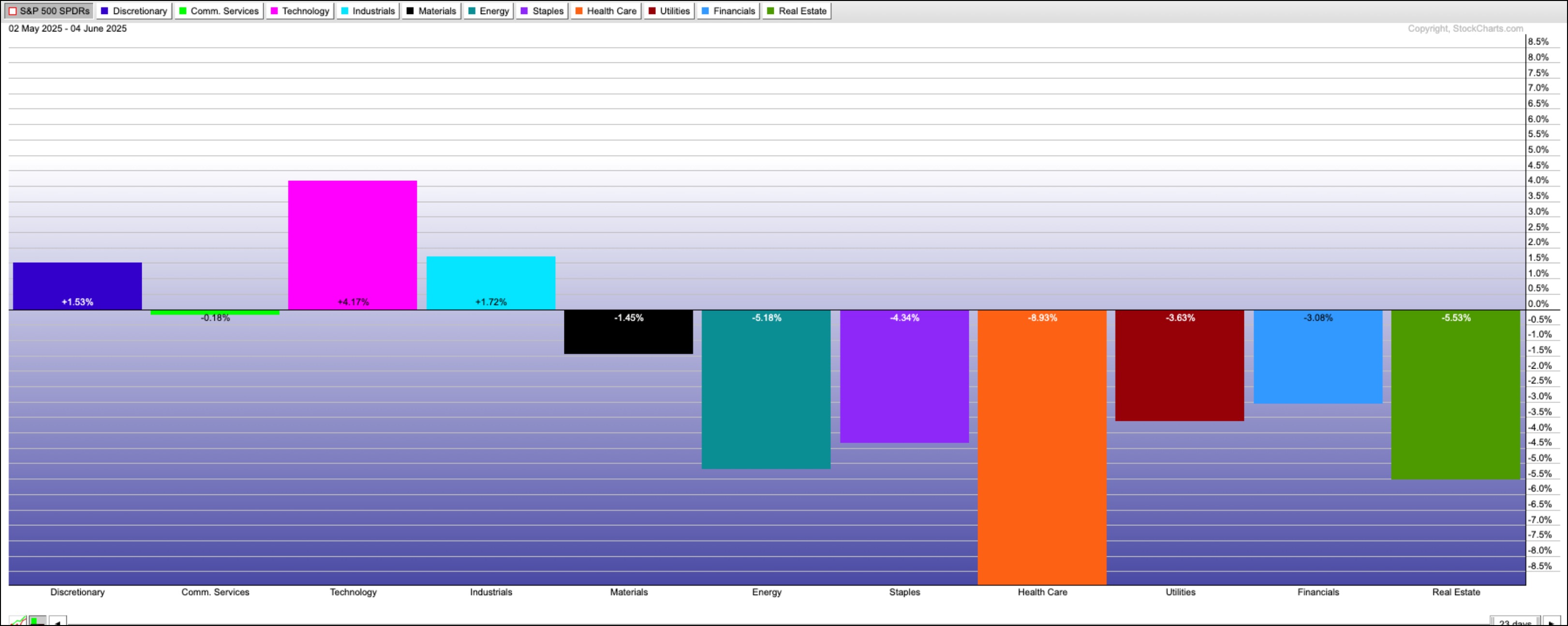
 Stay ahead of the market in under 30 minutes! In this video, Mary Ellen breaks down why the S&P 500 just broke out, which sectors are truly leading (industrials, technology & materials), and what next week’s inflation data could mean for your portfolio.

 This week, we got a smorgasbord of jobs data — JOLTS, ADP, weekly jobless claims, and the nonfarm payrolls (NFP). Friday’s NFP, the big one the market was waiting for, showed that 139,000 jobs were added in May, which was better than the expected 130,000. Unemployment rate held steady at 4.2%, and average hourly earnings rose 0.4% for the month.


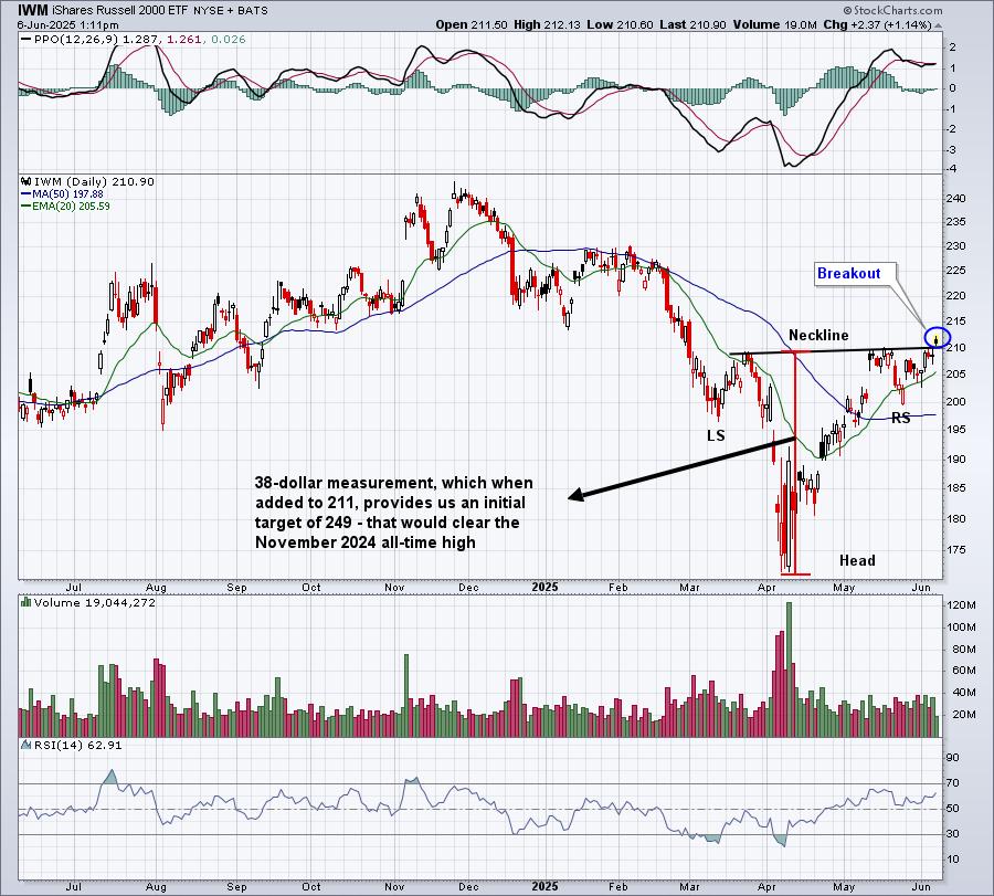

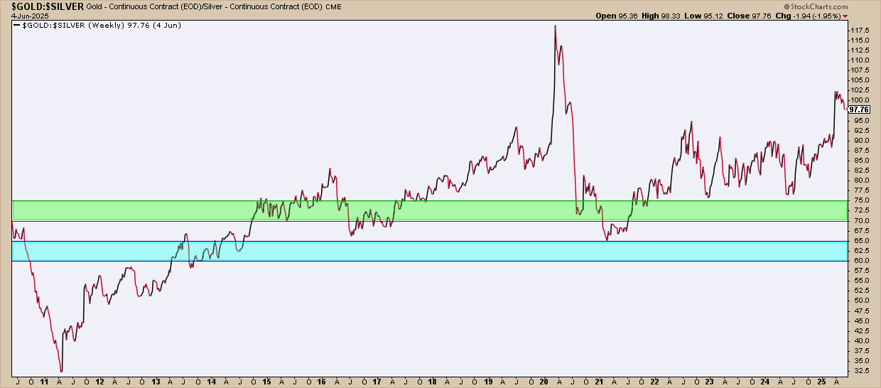
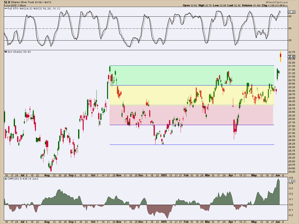
 Silver just hit a 13-year high, breaking above a key resistance level that could ignite a major bull run. Some metals analysts now say a rally to $40 isn’t a long shot, but a matter of time. So, are the odds finally shifting in favor of the bulls?
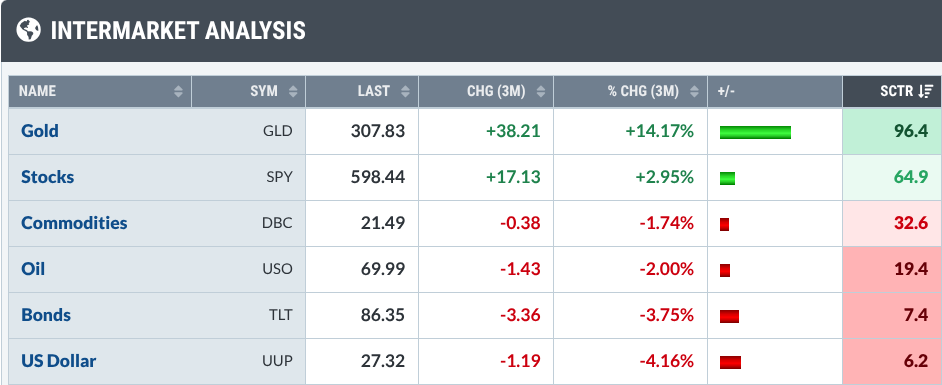

 Most religions of the world have the fundamental beliefs that are strikingly similar to the Ten Commandments. History has taught humanity that life does not seem to work well without such guiding principles. As responsible parents, we should have a parallel foundation of ten life skills that we impart part to our children. Your list will vary from mine, of course, but these are the ten essential precepts which I imparted to my son.


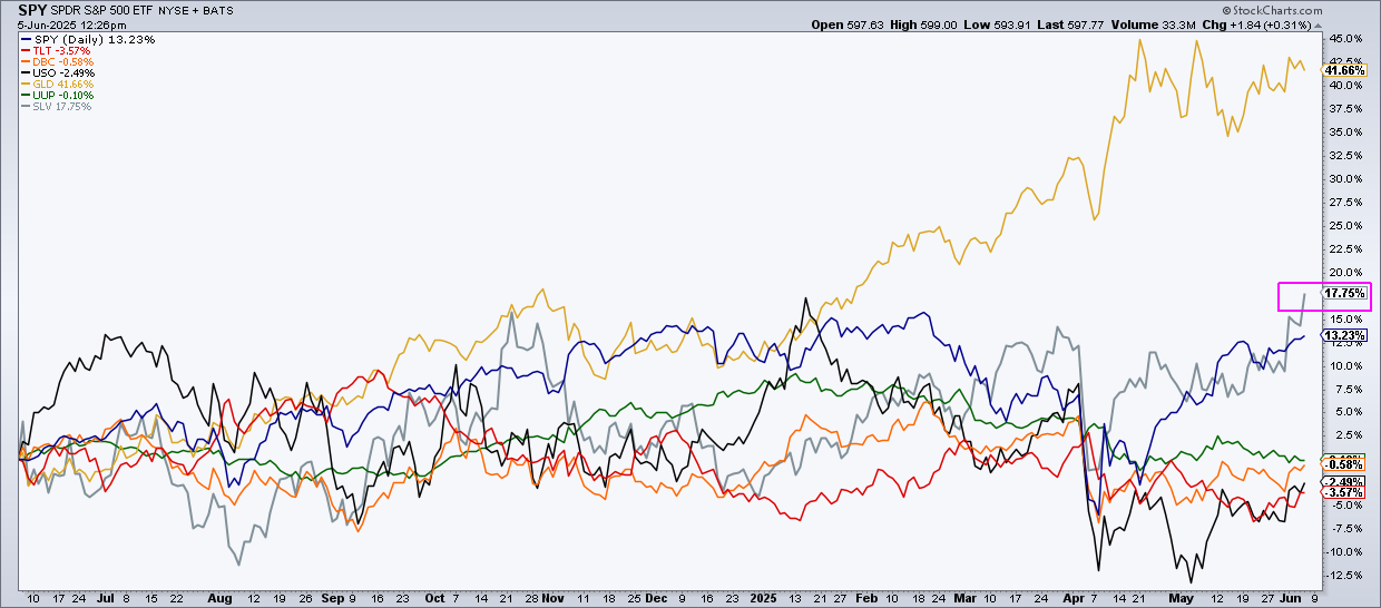
 A lot has happened in the stock market since Liberation Day, keeping us on our toes. Volatility has declined significantly, stocks have bounced back from their April 7 low, and the economy has remained resilient.