Category

Stock

Category

A lot has happened in the stock market since Liberation Day, keeping us on our toes. Volatility has declined significantly, stocks have bounced back from their April 7 low, and the economy has remained resilient.

If you’re still feeling uncertain, though, you’re not alone. The stock market’s in a bit of a “wait and see” mode, going through a period of consolidation as it figures out its next move. 

The S&P 500 ($SPX) is hesitating to hit 6000 despite reclaiming its 200-day simple moving average (SMA). This indecision can leave investors feeling stuck in “no man’s land.” And it’s not just the S&P 500, either; most major indexes are in a similar scenario, except for small caps, which have been left behind. This could be because the market has priced in a delay in interest rate cut expectations.

Tech Is Taking the Lead

If you drill down into the major indexes, there is some action you shouldn’t ignore. Tech stocks have started to take the lead again, although momentum has been lacking. Over the past month, the Technology sector has been up over 4%.

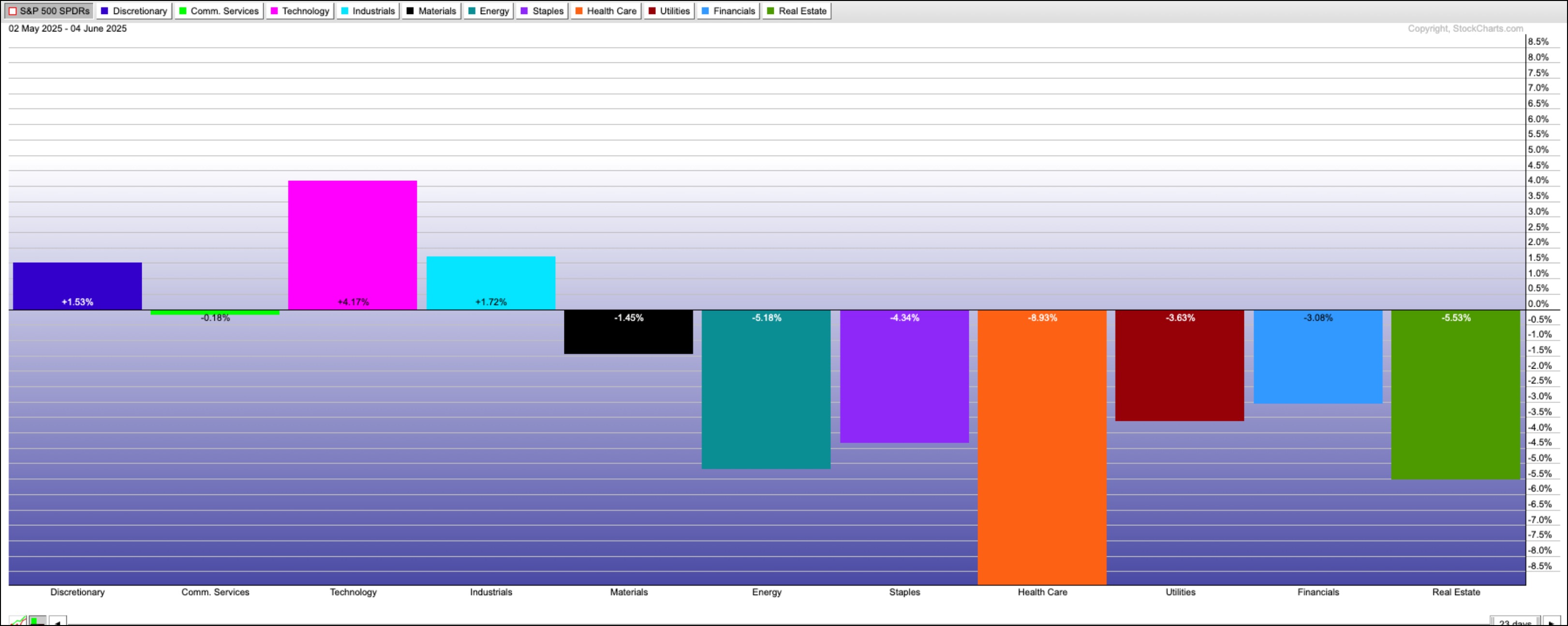
FIGURE 1. S&P SECTOR ETF PERFORMANCE OVER THE LAST 30 DAYS. Technology is the clear leader with a gain of over 4%.Image source: StockCharts.com. For educational purposes. It’s encouraging to see tech stocks regain their leadership position. Tech is a major force behind the S&P 500 and Nasdaq Composite ($COMPQ). The daily chart of the Technology Select Sector SPDR Fund (XLK) shows the ETF has been trying to break above a consolidation range it has been stuck in since mid-May.

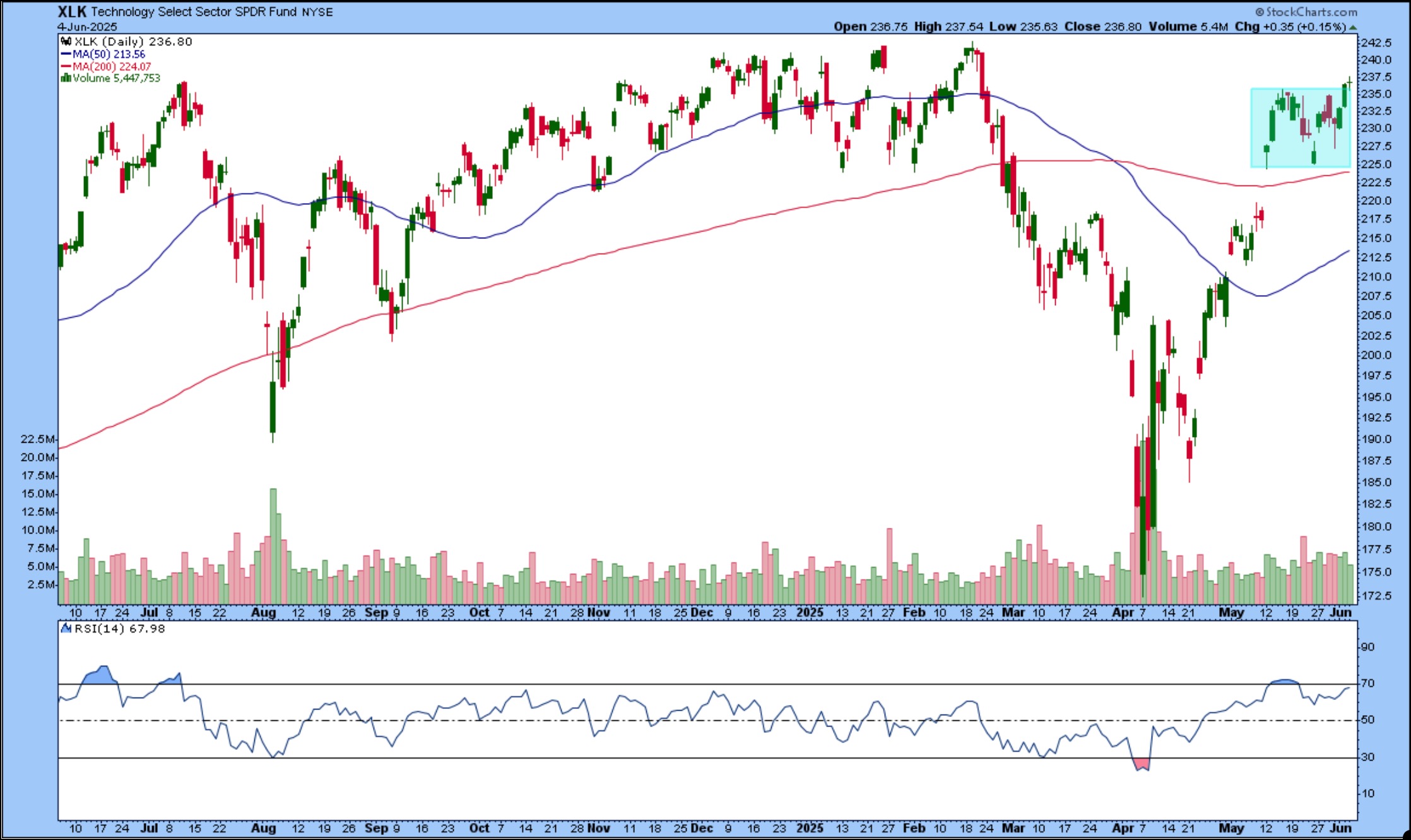
FIGURE 2. DAILY CHART OF XLK. Although the ETF has barely broken above its consolidation range, we need to see greater momentum to confirm a follow through to the upside.Chart source: StockCharts.com. For educational purposes.Nothing is standing in the way of XLK reaching its all-time high, but the momentum isn’t quite there yet. The 14-period relative strength index (RSI) is below 70 and looks to be stalling, pretty much in line with the overall stock market’s price action.

So, what’s the market waiting for? Maybe a catalyst, like Friday’s non-farm payrolls report. This week’s JOLTS, ADP, and ISM Services data didn’t move the needle much, but the NFP report could be the game changer.

S&P 500 Technical Forecast

Where could the S&P 500 go from here? Let’s dive into the weekly chart.

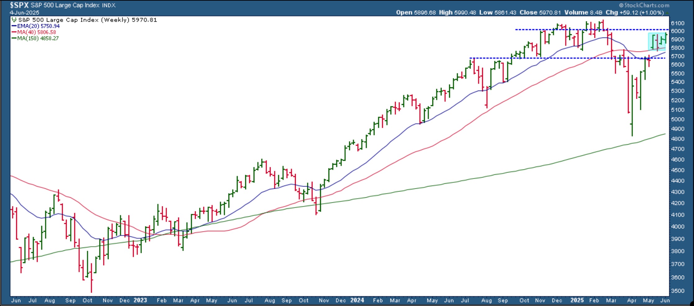
FIGURE 3. WEEKLY CHART OF THE S&P 500. The index is spitting distance to its all-time high. A break above the November high would clear the path to new highs.Chart source: StockCharts.com. For educational purposes.

The S&P 500 broke above its 40-week SMA on the week of May 12 and has held above it. However, it has been in a consolidation for the last month, similar to that of XLK.

The S&P 500 is approaching its November high of 6017. A break above it could push it toward new highs. On the flip side, if it slides below the 40-week SMA, it would be a cause for concern and could mean the May 12 gap-up could get filled. Keep an eye on the 5688 level. If the S&P 500 pulls back close to that level and turns around, it would be a healthy correction — an opportunity to buy the dip. A further downside move would mean exercising patience or unloading some of your positions.

What’s Going On With Gold and Bonds?

While stocks are grinding sideways, gold prices are rising, and bond prices are showing green shoots. This price action tells us that investors could be bracing for slower growth ahead. It’s not something to panic about — just something to watch.

You can get a quick look at what gold, bonds, and all the major indexes are doing by checking out the StockCharts Market Summary page and Your Dashboard.

So, what should you do?

Hold, add, or fold? That’s the big question. The market needs time to digest a lot, from economic data to geopolitical risks and policy headlines. Keep checking in and monitor the sectors, observe index performance, and note how other areas of the market, such as precious metals and bonds, are reacting.


 Disclaimer: This blog is for educational purposes only and should not be construed as financial advice. The ideas and strategies should never be used without first assessing your own personal and financial situation, or without consulting a financial professional.

In this video, Joe walks through a comprehensive lesson on using the ADX (Average Directional Index) as part of a technical analysis strategy. Joe explains the key components of the ADX indicator, how to interpret DI+ and DI- lines, and how to identify strong or weak trends in the market. He also covers how to combine ADX with price action and volatility to improve timing and trading decisions.

In addition, Joe analyzes SPY, QQQ, IWM, and individual stocks like AMPX, UNH, and more, focusing on trend conditions, MACD, price structure, and key moving averages.

The video premiered on June 4, 2025. Click this link to watch on Joe’s dedicated page.

Archived videos from Joe are available at this link. Send symbol requests to stocktalk@stockcharts.com; you can also submit a request in the comments section below the video on YouTube. Symbol Requests can be sent in throughout the week prior to the next show.

Despite the uncertainty prevailing in the markets, the Nasdaq 100 Index ($NDX) has proven resilient, perhaps more so than its peer benchmarks. The 90-day trade truce between the U.S. and China, initiated in May, boosted investor confidence. Yet that’s now at risk amid mutual accusations of violations.

Nevertheless, markets rallied on Tuesday morning after news that April job openings, one of a few key reports leading up to Friday’s jobs report, were better than expected. Still, signs of weakening demand, rising deficits, and declining CEO confidence suggest the economy remains fragile.

Why QQQ May Be Worth Watching Right Now

In light of the current environment, is it worth adding positions to Invesco QQQ Trust (QQQ), an $NDX proxy?

Shifting over to the StockCharts Market Summary page, you can see just how well $NDX is performing.

$NDX Breadth Metrics Reveal Bullish Participation

FIGURE 1. BREADTH AND BPI PANELS ON THE MARKET SUMMARY PAGE. While other indexes are growing increasingly bullish, you can see how the $NDX stands out.

Examining the Breadth panel on the left and zooming in on the moving averages, the $NDX has the most stocks trading above the 200-day simple moving average (SMA), a bullish signal considering that breadth of participation is critical when gauging the performance of an index. On the right panel, another breadth reading — the Bullish Percent Index (BPI) — tells you that 76% of the stocks in the index are triggering Point & Figure Buy Signals, giving you another angle on breadth, which happens to be in alignment.

Now that you’ve seen how $NDX is outperforming in terms of breadth, you’re probably curious about how many stocks are hitting new highs relative to the other indexes. Also, are there any particular standout subsectors or industries?

The New Highs panel can help answer both questions.

FIGURE 2. MARKET SUMMARY NEW HIGHS PANEL. The $NDX leads across the board, which asks the next question: Are there any standout sectors or industries represented within the index?

The $NDX has the highest percentage of stocks hitting new highs. If you click the Nasdaq 100 link, it will bring up a list of stocks in the index. The ones with a StockCharts Technical Rank (SCTR) score above 90 are listed below.

FIGURE 3. $NDX STOCKS WITH SCTR SCORES ABOVE 90. It’s a mixed bag in terms of industry.

The mix of subsectors and industries indicates there’s no one particular grouping (like all semiconductors or all AI stocks) leading the index. The $NDX’s outperformance is distributed across different areas.

So, back to the original question: is it worth entering or adding positions to QQQ?

Strategically, the outlook is murky. Geopolitical tensions and policy reversals can shift the market landscape overnight. But tactically, technical signals may offer potential entry points if you know where to look.

QQQ Weekly Chart: A Technical Rebound With Caveats

Let’s start with a broader view of QQQ, which is the likely investment vehicle for those who want to go long the $NDX. Here’s a weekly chart.

FIGURE 4. WEEKLY CHART OF QQQ. The ETF sharply recovered from a steep drop, but is there enough investor conviction to break above, or even test, its all-time high?

You can see how QQQ recovered sharply from its drop over the last quarter. While it’s trading above its 40-week SMA (equivalent to the 200-day SMA), you can also see how the 10-week SMA (or 50-day SMA equivalent) has fallen below it. Is it a false Death Cross signal, or is it indicating that the QQQ may not have enough momentum or investor conviction to test and break above its all-time high?

Zooming In: Key Support and Resistance Levels

To get a clearer picture, let’s zoom in on a daily chart.

This chart shows QQQ’s recovery in detail. There are several technical features converging to suggest critical support and resistance areas.

FIGURE 5. DAILY CHART OF QQQ. The key zones are highlighted. Now it’s a matter of seeing what QQQ does next.

Here’s a breakdown of the key things to watch:

  • Note the long Volume-by-Price levels (on the left) and how they correspond to the green- and yellow-shaded areas, indicating a high concentration of trading activity which can serve (or has served) as support and resistance.
  • The green range is where QQQ’s price is currently hovering, and the question is whether the ETF can break above it, opening up a path to test its all-time highs, or whether it will fall further.
  • The space between the 200-day SMA and the yellow-shaded area marks a critical support range. QQQ has respected the 200-day SMA before, bouncing off it as price tested the level (blue arrows).
  • The yellow-shaded area, another support range, marks a convergence of historical swing highs and lows (see blue arrows), serving as both resistance and support. It’s also another area of concentrated trading activity.

If QQQ falls below the green area, failing to advance higher, then you can expect support at the 200-day SMA (near $495) or the yellow-shaded range ($465 – $470). Below that, there’s another support range (shaded in red) near $430, but a decline to this level might also suggest weakness in investor conviction.

So far, the Relative Strength Index (RSI) is just below the 70-line, indicating room to run should there be enough momentum to advance it. However, the Chaikin Money Flow (CMF), though well above the zero line, shows that buying pressure may be dwindling a bit, enough to watch closely, since volume often precedes price direction.

At the Close

The Nasdaq 100 may be navigating a messy macro backdrop, but its breadth, momentum, and leadership show promise. Strategically, the terrain is uncertain. Tactically? The charts suggest a practical setup for those who are looking to lean into strength.


Disclaimer: This blog is for educational purposes only and should not be construed as financial advice. The ideas and strategies should never be used without first assessing your personal and financial situation, or without consulting a financial professional.

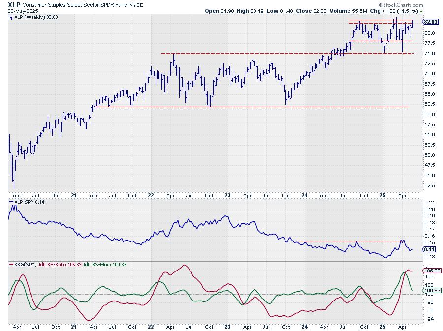
In this market update, Frank breaks down recent developments across the S&P 500, crypto markets, commodities, and international ETFs. He analyzes bullish and bearish chart patterns, identifies key RSI signals, and demonstrates how “Go No Go Charts” can support your technical analysis. You’ll also hear updates on Ethereum, Bitcoin, the Spain ETF, silver miners, USO (oil), and sector ETFs like XLP and XLV.

This video originally premiered on June 3, 2025.

You can view previously recorded videos from Frank and other industry experts at this link.

In this video, Dave shares his weekly stock scan strategy used to identify bullish stock trends. He illustrates how to set up this powerful scan, reveals the tips and tricks he uses to identify the most constructive patterns, and explains the four winning chart setups that tend to come up week after week.

Whether you’re a beginner or seasoned trader, this guide will enhance your charting process and help you uncover winning trade setups using technical analysis.

This video originally premiered on June 3, 2025. Watch on StockCharts’ dedicated David Keller page!

Previously recorded videos from Dave are available at this link.

In this video, Mary Ellen highlights key areas of the stock market that gained strength last week, including Staples and Aerospace stocks. She also shares several Dividend Aristocrat stocks that can help stabilize your portfolio in times of market volatility. Whether you’re seeking defensive plays or looking to align with sector rotation trends, this video provides practical insights to strengthen your trading strategy.

This video originally premiered May 30, 2025. You can watch it on our dedicated page for Mary Ellen’s videos.

New videos from Mary Ellen premiere weekly on Fridays. You can view all previously recorded episodes at this link.

If you’re looking for stocks to invest in, be sure to check out the MEM Edge Report! This report gives you detailed information on the top sectors, industries and stocks so you can make informed investment decisions.

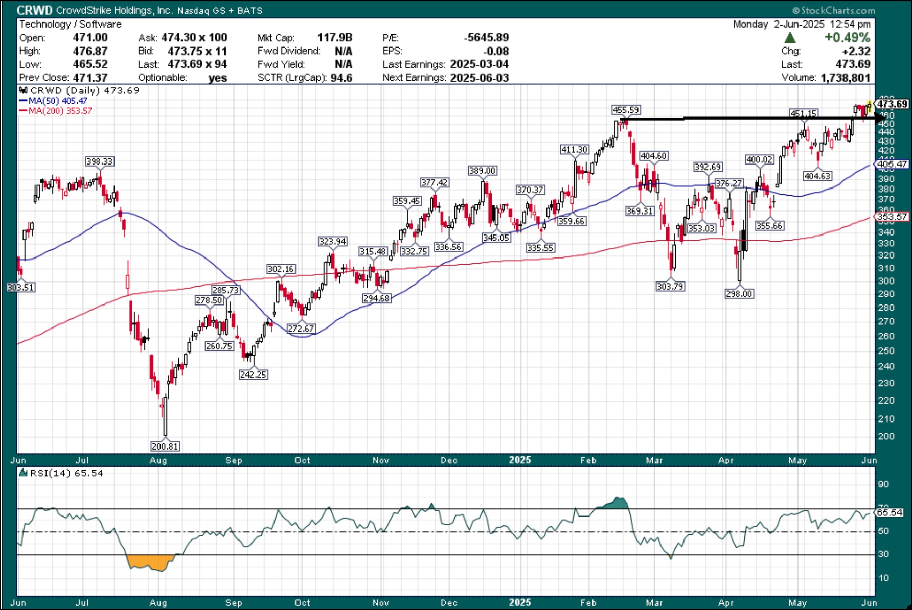
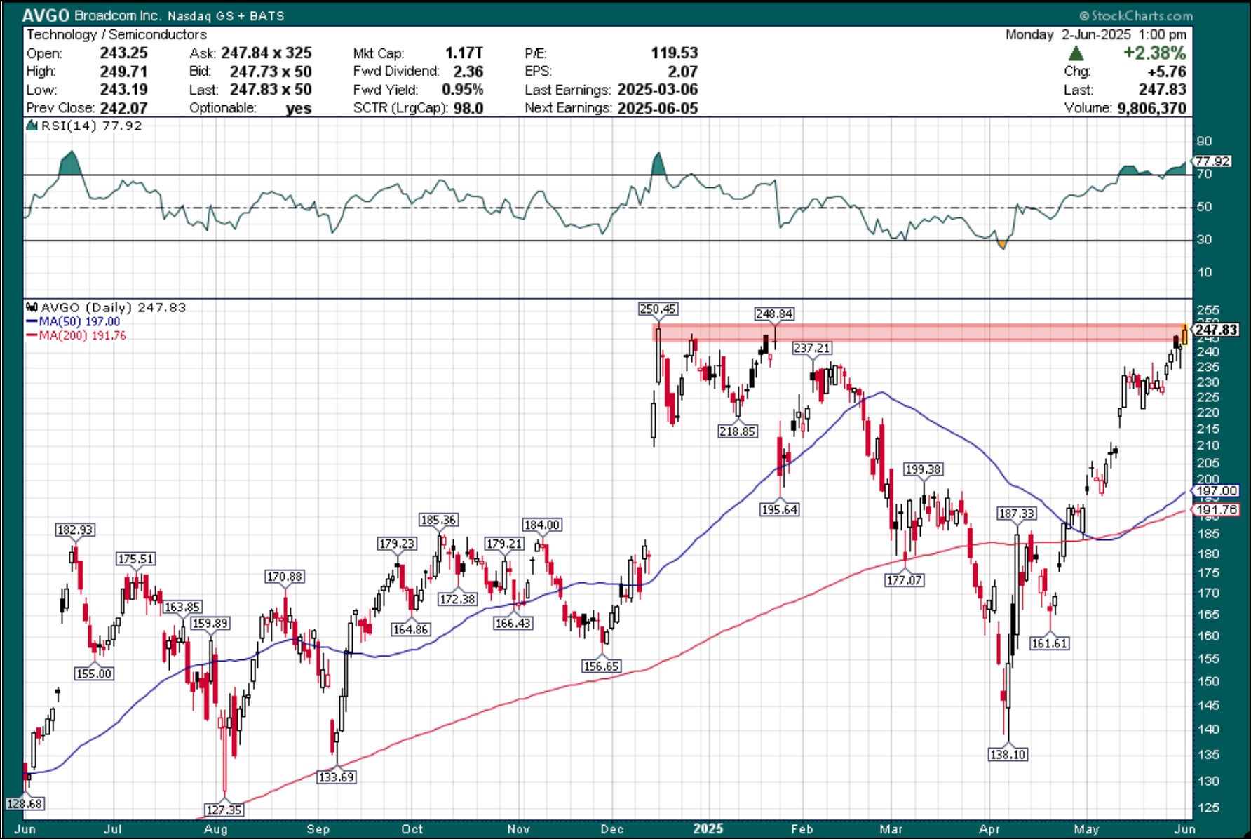
Earnings season may be winding down, but a few standout names could still make headlines this week. If you’re looking for potential moves, keep an eye on these three stocks — Dollar Tree, Inc. (DLTR), CrowdStrike Holdings, Inc. (CRWD), and Broadcom, Inc. (AVGO).

Each of these names is at a pretty interesting inflection point right now. It might be worth waiting to see how things play out before making any big bets.

Dollar Tree (DLTR): Quiet Comeback with Room to Run?

Dollar Tree (DLTR) broke out of a long-term downtrend and, as of the last quarter, is back above key moving averages. Many of the beaten-down discount chains, such as Five Below (FIVE) and Dollar General (DG), have started to reverse major downtrends. This week, we will see if earnings momentum can keep going, as DLTR stock has rallied 21% year-to-date.

Investors will be looking for insight into how DLTR is navigating the transition after the $1 billion Family Dollar sale (yes, they paid $8.5 billion in 2015) and how its core stores are performing in the current economic environment. The last two quarters have been relatively calm, as DLTR stabilized with minor gains of 3.1% and 1.9%. That stability comes after a three-quarter losing streak, with average losses of -13.7%.

From a technical standpoint, DLTR made its big move in mid-April as it broke out of a longer-term neutral range and a long-term downtrend. The stock price has eclipsed the 50- and 200-day moving averages and seems to be back on the right track.

The breakout of the rectangular bottom gives an upside target of roughly $98 a share, so there is room for DLTR to run. That move would fill the gap created last September and bring shares into a stronger resistance area around $100. On the downside, there may be an opportunity to enter DLTR, as we have a potential scenario where old resistance becomes support, giving an entry level around $79.50/$80. That would be a good risk/reward set-up for those who may have missed the initial breakout.

Overall, the stock still has room to run, but most of this upside move may already be in the stock, as the price approached an overbought condition with much overhead resistance ahead.

CrowdStrike (CRWD): Heating Up Before Earnings

CrowdStrike (CRWD) has returned from the ashes after last year’s Delta Air Lines, Inc. (DAL) computer outage that caused over 7000 cancelled flights. As it heads into this week’s earnings, shares are trading just under all-time highs.

The cybersecurity company has seen shares decline over the past two results, but that hasn’t stopped its continued momentum. The stock averages a one-day move of +/- 8.5%, so expect volatility.

Technically, CRWD comes into the week at an intriguing pivot point. After breaking out to new highs, the stock pulled back to its old resistance areas from which it broke above.  Will old resistance become support, or are we looking at a potential bull trap?

The relative strength index (RSI) indicates there may be room to run. We have seen some extreme overbought conditions in the past, and we are not there yet. A solid beat and guide could see additional momentum in what continues to be one of the top stocks within the cybersecurity sector.

Speaking of strength, CRWD is shining on a relative basis. It’s up 36.7% year-to-date, outperforming CIBR, the biggest cybersecurity ETF in CIBR, which is up 12.8%. That said, downside risk could be steep given the recent run. Stepping in front of this stock ahead of results could be costly. On weakness, wait for a better risk/reward entry and look for support just around $405.

Broadcom (AVGO): Ready to Step Out of Nvidia’s Shadow?

Broadcom (AVGO) is Nvidia’s baby brother. It is in the $1 trillion market cap club, a top holding in both the Semiconductor ETF (SMH), the Technology ETF (XLK), and the Nasdaq 100 (QQQ).

AVGO has grown mightily in NVDA’s shadow for years now. Shares have rallied just over 500% from their 2022 lows, which pales to the 1250+% rally in Nvidia. However, over the past 52 weeks, AVGO shares have risen 82% compared to Nvidia’s 23% gain.

Now that we’ve seen how price action settled out with NVDA, what could this mean for AVGO?

Technically, if AVGO wanted to step out of NVDA’s shadows, this would be the chance to do so and lead the semiconductors higher. However, momentum is waning, and we continue to see large caps struggle to make new highs.

The table is set for a potentially large breakout. AVGO is at a key resistance area just under $250. It couldn’t break through it last week, but could earnings be the catalyst for getting it over the top? Given the overbought conditions and tough market environment, it should be a challenge. You may be able to buy this stock on a dip and wait for the rest of the market to catch up as we look for more clarity on tariff policy. Look for a pullback to the $220 area to add to or enter the name.

Long-term investors should ignore the noise to come. AVGO has suffered through the worst and should break out in due time. It just may not be this time.

Staples and Tech Swap Positions Again

The weekly sector rotation continues to paint a picture of a market in flux, with defensive sectors gaining ground while cyclicals take a step back. This week’s shifts underscore the ongoing volatility and lack of clear directional trade that’s been characteristic of recent market behavior.

The sudden jump in relative strength for defensive sectors last week has pushed Consumer Staples back into the top 5 at the cost of Technology.

  1. (1) Industrials – (XLI)
  2. (3) Utilities – (XLU)*
  3. (6) Consumer Staples – (XLP)*
  4. (2) Communication Services – (XLC)*
  5. (4) Financials – (XLF)*
  6. (5) Technology – (XLK)*
  7. (8) Real-Estate – (XLRE)*
  8. (9) Materials – (XLB)*
  9. (7) Consumer Discretionary – (XLY)*
  10. (11) Healthcare – (XLV)*
  11. (10) Energy – (XLE)*

Weekly RRG

Looking at the weekly Relative Rotation Graph (RRG), we’re seeing some interesting movements. Industrials continues its upward trajectory on the RS-Ratio scale, solidifying its top position.

Meanwhile, utilities and consumer staples — our #2 and #3 sectors, respectively — are maintaining high RS-Ratio levels despite a momentum setback.

Communication services and financials, rounding out the top 5, find themselves in the weakening quadrant.

However, they’re still comfortably above the 100 level on the RS-Ratio scale. This positioning gives them a good shot at curling back into the leading quadrant before potentially hitting lagging territory.

Daily RRG

Switching to the daily RRG, we can see some significant moves over the past week.

Consumer staples have made a considerable leap, landing deep in the improving quadrant with the highest RS-Momentum reading. This surge explains its return to the top 5.

Utilities isn’t far behind, also making a strong move into the improving quadrant.

Financials, while in the lagging quadrant, are showing less dramatic movement compared to staples and utilities.

Its shorter tail on the RRG indicates a less powerful move, but its high position on the weekly RRG is keeping it in the top 5 — for now.

Industrials: Strength Confirmed

The #1 sector is pushing against overhead resistance around 143 for the third consecutive week.

A break above this level could trigger an acceleration higher.

The relative strength chart vs. the S&P 500 has already broken out, continuing to pull the RRG lines upward.

Utilities: Bouncing Back

After a weak showing two weeks ago, utilities closed last week at the top of its range.

There’s still resistance lurking just below 85 (around 84), but a break above could spark a rally.

The raw RS line is grappling with the upper boundary of its sideways trading range, causing the RRG lines to roll over while remaining in the leading quadrant.

Consumer Staples: Testing Resistance

Staples has rebounded to the upper boundary of its trading range, with key resistance between 82 and 83.50.

A spike to $83.90 represents the recent high-water mark. Breaking above this barrier could accelerate the move higher.

The raw RS line has peaked against overhead resistance and needs to form a new low to support the RRG lines.

Communication Services: Holding Steady

XLC is trading around $ 101.40, with overhead resistance a few dollars away, near $ 105.

The raw RS line remains within its rising channel, but we’ll need to see improved relative strength soon to maintain this positive trend.

The sector sits in the weakening quadrant but has the potential to push back into leading territory with a strong relative strength (RS) rally.

Financials: At a Crossroads

The financial sector is struggling with old resistance that’s now acting as support.

Its RS line is testing the lower boundary of its rising channel.

Financials needs a couple of strong weeks in both price and relative strength to maintain its top 5 position.

Portfolio Performance

As of last Friday’s close, our model portfolio is lagging the S&P 500 by just over 5%.

This performance gap has widened slightly from last week but remains in line with the volatile sector rotations we’ve been seeing.

The current market environment presents an apparent dilemma for sector rotation strategies. While defensive sectors are gaining prominence, cyclicals are taking a back seat — at least for now.

This flip-flop situation is common in volatile markets seeking direction, but it’s causing more frequent trades in our model than we’d typically expect.

For meaningful trends to emerge, the market needs to stabilize and establish a clear directional bias. Until then, we’re likely to see continued back-and-forth movement as investors grapple with mixed economic signals and shifting sentiment.

#StayAlert and have a great week. –Julius


Over the past five sessions, the Indian equity markets headed nowhere and continued consolidating in a defined range. In the previous weekly note, it was categorically expected that the markets might stay devoid of any directional bias unless they either take out the upper edge or violate the lower edge of the consolidation zone. In line with the analysis, the Nifty oscillated in a 401.90-point range over the past five days. The volatility also retraced; the India Vix came off by 6.95% to 16.08 on a weekly basis. While staying absolutely range-bound, the headline index Nifty 50 closed with a minor weekly loss of 102.45 points (-0.41%).

As we step into the new week, the markets find themselves in a defined trading range, more toward the edge of the pattern support on the weekly chart. The Nifty appears to continue being in a well-defined trading range between 25100 and 24500 levels. This also implies that a directional trend would emerge only if the Nifty takes out 25100 convincingly or ends up violating the 24500 level. Unless either of these two things happens, the markets will remain devoid of directional bias and will continue staying in this defined range. The present technical structure makes it even more important to maintain a steadfast focus on protecting profits at higher levels and the rotation of sectors where a likely leadership change is visible.

The coming week is expected to see the levels of 25000 and 25175 acting as resistance points. The supports come in at 24500 and 24380 levels.

The weekly RSI is at 59.02; it stays neutral and does not show any divergence against the price. The weekly MACD is bullish and remains above its signal line.

The pattern analysis shows that after forming the most recent swing high at 25116, the Nifty has resisted this level for two subsequent weeks. This makes the level of 25100-25150 an important hurdle for the Nifty. Secondly, the Index has closed just at the support of an upward rising trendline; if this gets violated, the markets may see some more corrective retracement. Overall, the zone of 24500-24600 remains a crucial support area for the markets.

While the Nifty stays in the 25100-24500 zone and consolidates, focusing on protecting profits at higher levels would be wise. While the market keeps its underlying trend intact, it continues to remain prone to some extended corrective retracement until the levels of 25100 are taken out on the upside convincingly. During this phase, it makes more sense to keep leveraged exposures at modest levels and stay highly selective in making fresh purchases. While limiting the purchases to favorably rotating sectors, a cautious outlook is recommended for the coming week.


Sector Analysis for the coming week

In our look at Relative Rotation Graphs®, we compared various sectors against the CNX500 (NIFTY 500 Index), representing over 95% of the free-float market cap of all the listed stocks. 

Relative Rotation Graphs (RRG) show that the Nifty PSU Bank Index is the only Index inside the leading quadrant that continues to improve its relative momentum against the broader markets. The other sectors present inside the leading quadrant are PSE, Infrastructure, Consumption, and FMCG, and these groups show continued paring of relative momentum against the broader markets.

The Nifty Commodities and the Nifty Bank Index have rolled inside the weakening quadrant. The Financial Services and the Services sector Indices are also inside the weakening quadrant.

The Nifty Metal Index has rolled inside the lagging quadrant. It is likely to relatively underperform along with the Pharma Index which also continues to languish inside this quadrant. The IT Index is also inside the lagging quadrant, but is seen sharply improving its relative momentum against the broader markets.

The Realty, Media, Energy, Midcap 100, and Auto Indices are inside the improving quadrant. They are likely to continue improving their relative performance against the broader Nifty 500 Index.


Important Note: RRG™ charts show the relative strength and momentum of a group of stocks. In the above Chart, they show relative performance against NIFTY500 Index (Broader Markets) and should not be used directly as buy or sell signals.  


Milan Vaishnav, CMT, MSTA

Consulting Technical Analyst

www.EquityResearch.asia | www.ChartWizard.ae

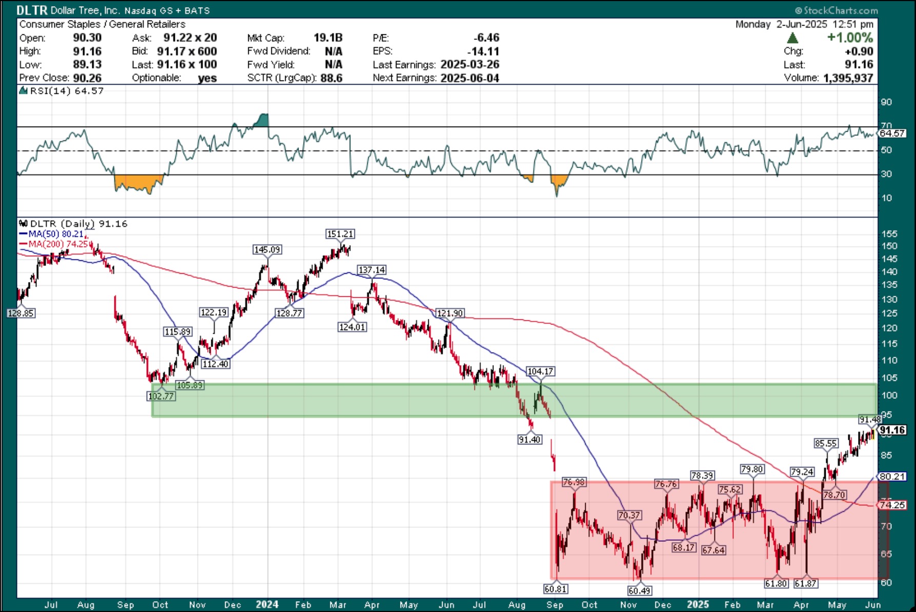
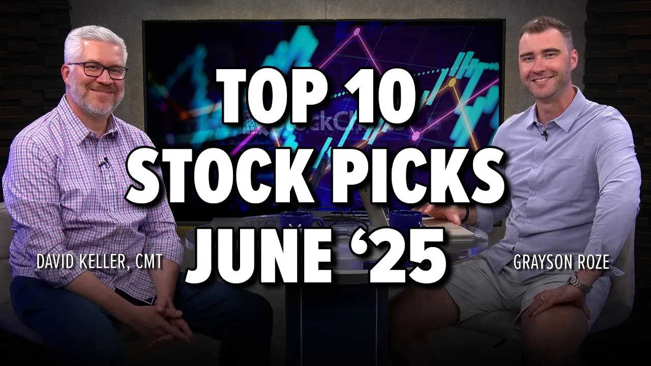
Discover the top 10 stock charts to watch this month with Grayson Roze and David Keller, CMT. From breakout strategies to moving average setups, the duo walk through technical analysis techniques using relative strength, momentum, and trend-following indicators.

In this video, viewers will also gain insight into key market trends and chart patterns that could directly impact your trading strategy. Whether you’re a short-term trader or a long-term investor, this breakdown will help you stay one step ahead.

This video originally premiered on May 30, 2025. Click on the above image to watch on our dedicated Grayson Roze page on StockCharts TV.

You can view previously recorded videos from Grayson at this link.