Category

Stock

Category

There’s no denying that the equity markets have taken on a decisively different look and feel in recent weeks.  We’ve compared the charts of the S&P 500 and Nasdaq 100, as well as leading growth stocks like Nvidia, to an airplane experiencing a “power-on stall”.  Basically, the primary uptrend has been paused, but it’s unclear whether we’ll resume the uptrend after a brief corrective period.

I stand by my previous comments that the 200-day moving average, as well as the price gap formed in early May, remains the most important “line in the sand” for this market.  And as long as the S&P 500 and other leading names remain above their 200-day moving averages, then equities are still in decent shape.

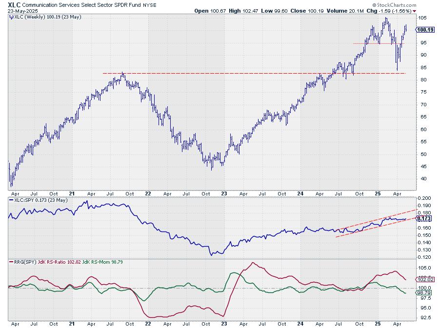
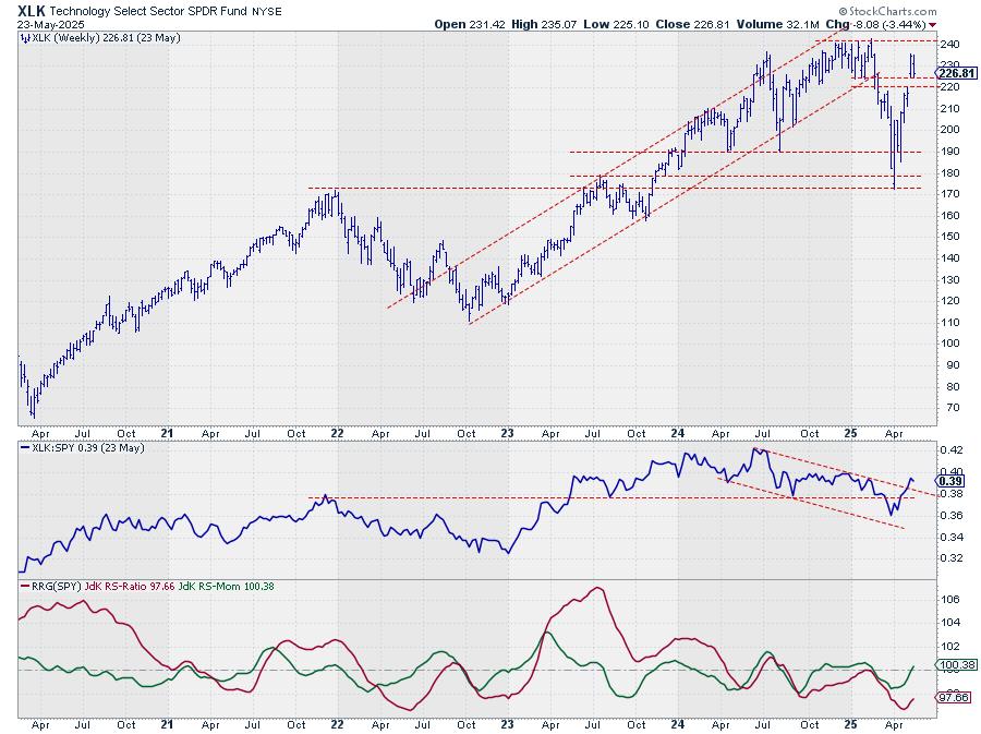
One of the key features of this market off the early April has been the dominance of traditionally “offensive” sectors such as technology and consumer discretionary.  But are these leading sectors maintaining their leadership role as we progress through the spring months into the summer?

Leading Sectors Off the April Low Starting to Falter

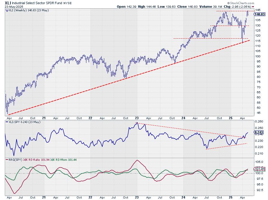
My Market Misbehavior LIVE ChartList includes a series of relative strength charts showing the performance of key sectors versus the S&P 500.  When these lines are trending higher, the sector is outperforming the benchmark.  Generally speaking, I’d prefer to own stocks where the relative strength line is trending higher, as that confirms I’m doing better than a passive investment strategy!

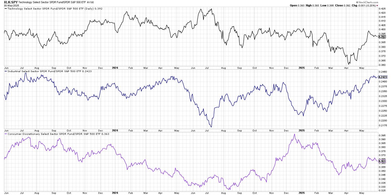
Only three sectors have outperformed the S&P 500 index over the last month: technology, industrials, and consumer discretionary.  Notice how two of those sectors, technology and consumer discretionary, are seeing a downturn in relative strength over the last week?  It still may be early to declare a full leadership rotation, but this initial downturn in the relative performance could be a sign of further weakness to come.

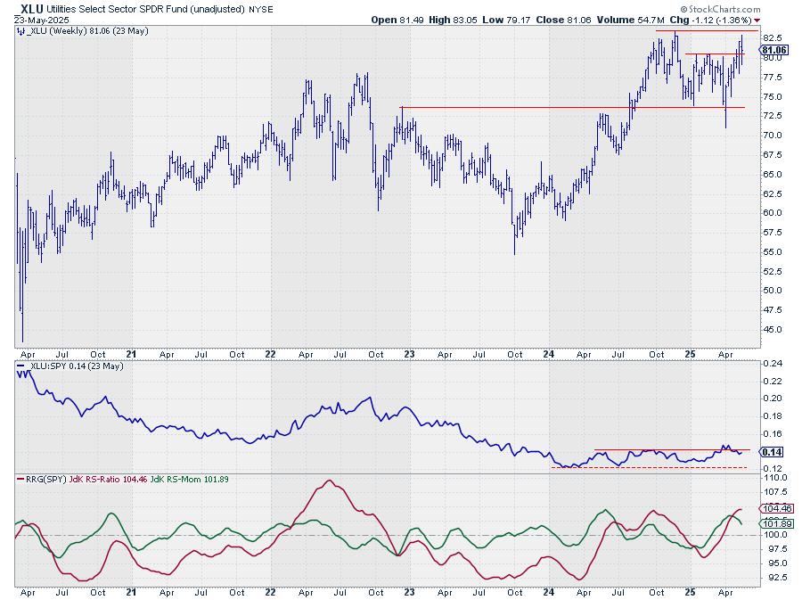
Defensive Sectors Showing Early Signs of Strength

So if these leadership sectors are starting to slow down, which sectors are showing an improving relative strength?  Our next chart shows the relative performance of the four traditionally defensive sectors, most of which have turned higher over the last two weeks. 

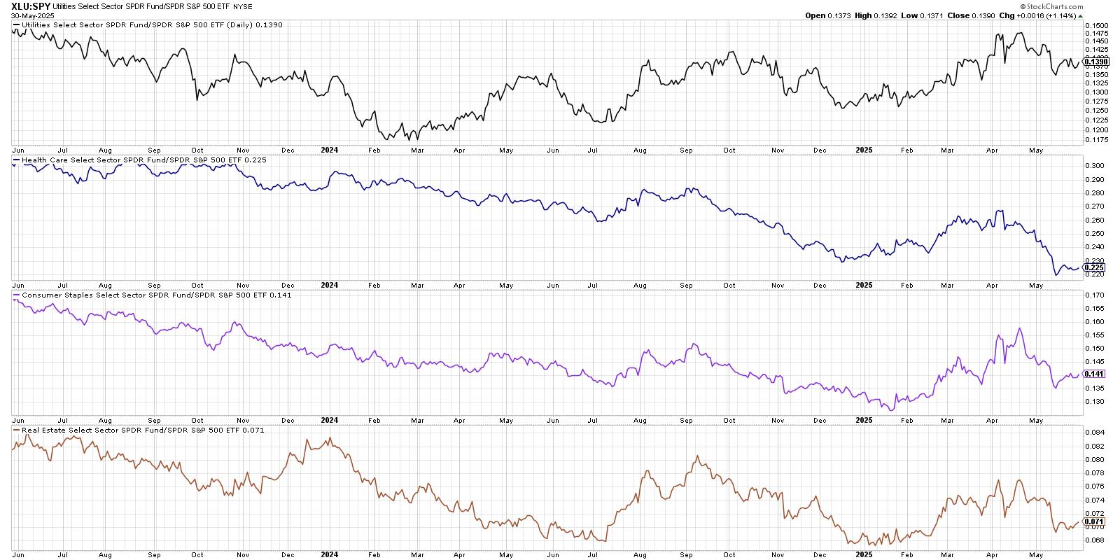
Again, I’d hesitate to declare this a full and confirmed rotation, but the fact that defensive sectors are improving here suggests investors are beginning to reallocate a bit to more risk-off positions.  Over the next few weeks, improvement in these defensive sectors could provide a clear validation to a “market in correction” thesis.

Relative Rotation Graphs Confirm Defensive Rotation

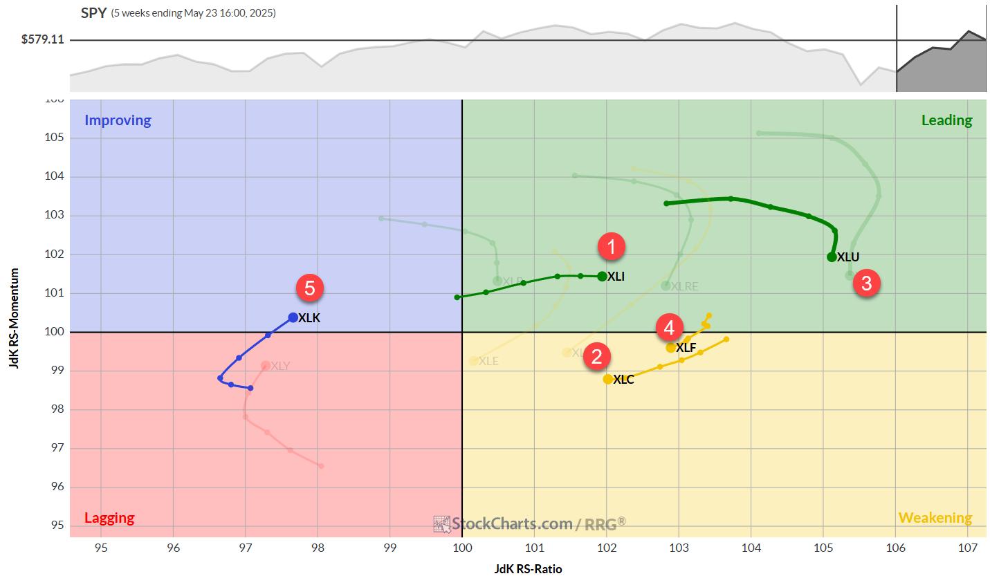
Of course, when we’re talking about sector rotation, I always want to bring up the Relative Rotation Graphs (RRG) and benefit from Julius de Kempenaer’s innovative data visualization approach.  First, let’s see how the daily RRG showed the 11 S&P 500 sectors back in early May.

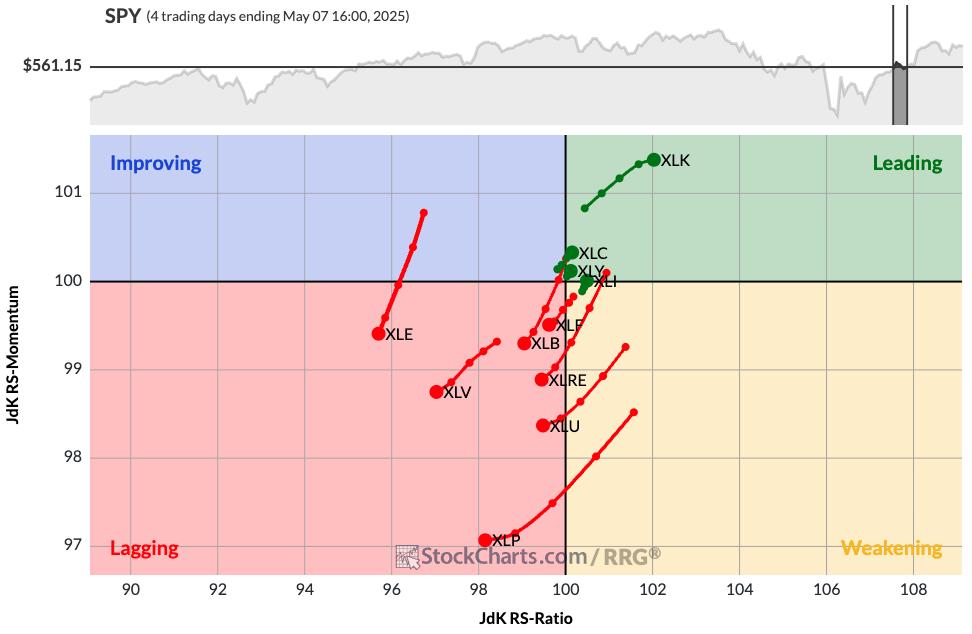
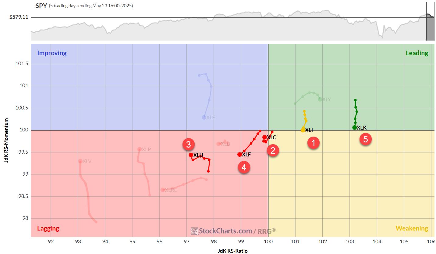
We can see that the Leading quadrant includes those leading sectors such as technology.  In the Lagging quadrant we’ll find pretty much everything else, including all four of the defensive sectors discussed above.  Now let’s fast forward to the current RRG and see how things have rotated.

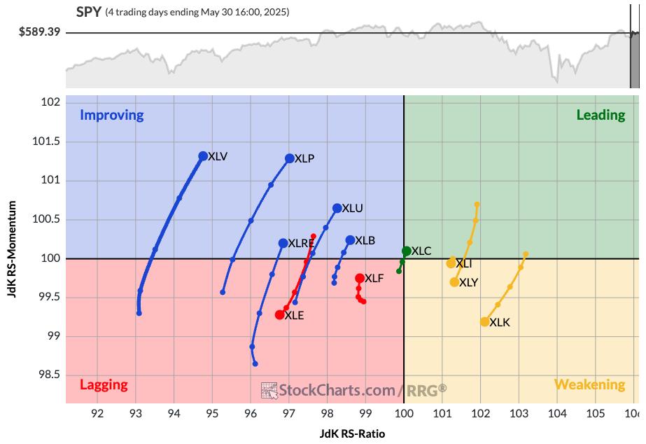
Now you’ll find health care, consumer staples, and other defensive sectors in the Improving quadrant.  Technology, industrials, and consumer discretionary have now rotated down into the Weakening quadrant.  So the RRG is showing at least an initial rotation away from the sectors that have been leading off the April market low.

One of the most important arguments from the bulls has been the dominance of offensive sectors over the last six weeks.  But as we’ve shown here today, the sector may be changing from a clearly bullish reading to a much more defensive warning sign for investors.


RR#6,

Dave

PS- Don’t miss our daily market recap show on YouTube every trading day at 5:00pm ET!

David Keller, CMT

President and Chief Strategist

Sierra Alpha Research LLC

marketmisbehavior.com

https://www.youtube.com/c/MarketMisbehavior

Disclaimer: This blog is for educational purposes only and should not be construed as financial advice.  The ideas and strategies should never be used without first assessing your own personal and financial situation, or without consulting a financial professional.  

The author does not have a position in mentioned securities at the time of publication.    Any opinions expressed herein are solely those of the author and do not in any way represent the views or opinions of any other person or entity.

Manage your stock portfolio like a pro! Learn stock portfolio management, trading strategy, and how to build stock watchlists like a professional investor with this insightful video from Grayson. He shares how to run your portfolio like a championship sports team—organizing stocks like players, keeping top performers in play, and tracking trade opportunities with precision.

This video originally premiered on May 30, 2025. Click on the above image to watch on our dedicated Grayson Roze page on StockCharts TV.

You can view previously recorded videos from Grayson at this link.

SIL Silver Miners

SIL was among the leaders yesterday and now is close to triggering this double-bottom bullish pattern. Staying above the 43-mark would target 47. That’s not a big move, but let’s remember that SIL is sporting bullish formations on its longer-term charts, too.

FIGURE 1. DAILY CHART OF GLOBAL X SILVER MINERS ETF (SIL).

SIL – Weekly

Firstly, the double-bottom pattern on this weekly log chart annotated in blue remains alive. This objective is up near 49.

Secondly, the area highlighted in green here is the same pattern pictured on the daily chart above. That area is sitting at the very top of a much bigger bullish inverse head-and-shoulders pattern that extends all the way back to 2021. Thus, if the short-term breakout works, it will trigger this one, as well. That target is in the mid-70s…

FIGURE 2. WEEKLY CHART OF GLOBAL X SILVER MINERS ETF (SIL).

SIL – Monthly

And that green pattern above is part of this MUCH larger, 13-year potential double bottom. We still have a while to go before this one is triggered, but it’s important to keep all of these in the back of our minds.

Anyone who trades or tracks SIL knows that short-term whipsaws are the norm. So, while these breakouts may not be clean, the bullish structures are clear. The bottom line is that if SIL continues to make higher highs and higher lows, the patterns will continue to work.

FIGURE 3. MONTHLY CHART OF GLOBAL X SILVER MINERS ETF (SIL).

USO Crude Oil

USO was among the leaders yesterday, but it’s still trying to bust through its 50-DMA, which has been the sticking point the last few weeks. If it can soon, USO could complete this potential bullish inverse H&S pattern. The upside target would be in the 77-78 range, and that would align with key short-term tops from the last year. First step, push above the 50-day line…

FIGURE 4. DAILY CHART OF US OIL FUND (USO).

NVDA

The obvious question every time NVDA rallies is whether it’s too late to buy.  To get a true sense of the stock’s technical prospects, we need to view it across different charts and time frames.

First, here’s a view of the bullish flag pattern we cited on Tuesday (along with TSLA, GOOGL and META). Given the preceding staircase-like advance, the starting point of the flagpole is subjective. We’re using the early May low given that the stock avoided filling a gap from a few days earlier.

Regardless, the measured move counts to the 161 zone, which would be a new all-time high.

FIGURE 5. DAILY CHART OF NVIDIA CORP. (NVDA).

This second one is a daily chart that extends all the way back to 2010 and shows times when breaking below or above the 200-DMA led to strong, extended moves for the stock. From this angle, the recent 200-day breach didn’t last that long at all, and now NVDA has the chance to once again follow through after breaking back above it over the last few weeks.

FIGURE 6. LONGER-TERM DAILY CHART OF NVIDIA CORP. (NVDA).

Here’s a weekly, log chart going back to the 2022 low. NVDA has leveraged three major pattern breakouts since then to power the astounding rally the last two-plus years. With the stock last having made a new high last October and being net flat since last July, an eventual push back above the 150-zone could prompt big pattern-breakout number four.

FIGURE 7. WEEKLY CHART OF NVIDIA CORP. (NVDA).

Lastly, here are the biggest breakouts on this monthly chart that goes back over two decades. Again, looking at it from this viewpoint makes the last 11 months appear like a very small digestive phase, especially compared to the other three on the chart. Thus, the first step will be seeing how well NVDA can hold the opening gap. That’s important for today, but much more important for the days and weeks to come.

FIGURE 8. MONTHLY CHART OF NVIDIA CORP. (NVDA).

Nuclear energy stocks are on a tear, and Oklo Inc. (OKLO), Cameco Corp. (CCJ), and NuScale Power Corporation (SMR) are leading the charge, fueled by presidential executive orders, investor hype, and hopes for a nuclear-powered future.

Is It Time to Go Nuclear?

These names bucked the trend on Wednesday, rising even as the major U.S. indexes fell. I found all three while running a P&F Double Top Breakout scan, with SMR also appearing in the New 52-Week Highs scan. But are these gains a sign of genuine investment opportunities, or is this high-risk subsector just radioactive for your portfolio? To analyze this, let’s break down their profiles and charts to see whether the “glow” here points to real promise—or simply masks a toxic risk.

Here’s a PerfCharts snapshot of all three stocks against the SPDR S&P 500 ETF (SPY), our broader market proxy.

FIGURE 1. PERFCHARTS OF SMR, OKLO, CCJ, AND SPY.

While CCJ steadily lagged behind the S&P 500 until this month, both OKLO and SMR began outperforming the broader market starting in mid-October of last year. Their relative performance to date is so strong that it appears almost unsustainable in the short term.

All three mid-cap stocks are also showing robust StockCharts Technical Rank (SCTR) scores—OKLO at 99.6, SMR at 99.3, and CCJ at 89.9 at the time of writing. While this can indicate technical strength, it can also signal irrational exuberance among retail investors.

Robust SCTR Scores but Divergent Fundamentals

Another thing to note is the notable difference in their fundamentals. SMR and OKLO have negative P/E ratios, suggesting that their surges are driven more by promise and speculation than by profits. CCJ, with a P/E ratio of 149, is raking in some profits, but may also be riding an overcrowded wave of hype.

Ultimately, while technical performance can sometimes lead to fundamental strength—or mask fundamental weakness—it’s worth taking a closer look at these leading names in the nuclear subsector to understand the opportunities and risks they present. Let’s break it down further by examining each stock’s technical picture and what it suggests about investor conviction.

OKLO: Testing Highs, Buying the Dip?

To start, here’s a daily chart of nuclear energy startup OKLO.

FIGURE 2. DAILY CHART OF OKLO. In contrast to the other two nuclear stocks, OKLO is potentially experiencing higher levels of accumulation.

OKLO recently tested its all-time high of $59 before pulling back. The Relative Strength Index (RSI) shows the stock was deep within overbought territory, hinting at caution. Still, what’s interesting is that OKLO’s Accumulation/Distribution Line (ADL), plotted behind the price, remains strong. This suggests that even as the price retreats, buying pressure may still be present—hinting that investors might be looking to buy the dip rather than “sell the news.”

The key thing to watch now is how deep this retracement goes. If investors are still optimistic about OKLO’s fundamental outlook, you might see a bounce within the first two quadrants marked by the Quadrant Lines on the chart. Pay particular attention to the critical support range around the center line at $38, shown in the yellow-shaded area. If the price falls below this level, it could be a sign of weakness, suggesting the stock is more of a FOMO-driven trade than one backed by long-term conviction.

SMR: Hype or Healthy Pullback?

Next, shift over to a daily chart of SMR. Among the three, SMR is the only to notch a new all-time high. But does this signal the beginning of a new leg up, or the end of a surge that lacks substance?

FIGURE 3. DAILY CHART OF SMR. What happens next will show whether investors truly believe in the stock—or if the rally was driven by short-term hype.

SMR immediately declined after making a parabolic move to a new all-time high. As the RSI confirms, the stock was well-overbought. Now, it’s a matter of measuring the depth of the pullback.

I plotted a Fibonacci Retracement to highlight potential support levels. There are several zones of support from previous swing highs and a concentrated trading area between the 61.8% and 38.2% retracement levels. If investor confidence stays strong, expect a possible bounce between $21 and $24, marking the 61.8% and 50% Fib levels respectively. A deeper drop below the 61.8% level might still find support around $15, but that would also suggest that the rally was driven more by sentiment than strategic conviction.

CCJ: Underperforming Stock, Profitable Company

Lastly, let’s take a look at the most earnings-positive company among the three. Here’s a daily chart of CCJ.

FIGURE 4. DAILY CHART OF CCJ. The critical level to watch is the range between $50 – $52.

CCJ has a similar technical profile to OKLO and SMR—it’s overbought, and it tested its all-time high on a parabolic surge, leading to a pullback.

However, instead of measuring the various degrees of its potential retracements (using Fib or Quadrants), I’m focusing on the key range of $50–$52. Why? Because, in addition to marking a broad level that has acted as both support and resistance since October of last year, this range also shows a high concentration of trading activity, as indicated by the Volume-by-Price indicator.

If longer-term conviction holds, CCJ should bounce at this level. If not, expect the stock to decline further—although it may eventually find support at lower levels, it likely wouldn’t be worth chasing at that point.

At the Close

Nuclear energy stocks like OKLO, SMR, and CCJ have captured market attention, defying broader trends and flashing bullish technical patterns. But while momentum and investor enthusiasm are driving these moves, each stock also faces questions about sustainability and fundamentals.

Are we looking at a healthy dip—or is Wall Street just selling the news? To answer that question, keep an eye on the key technical levels outlined above. With these standout names in an emerging (and therefore highly uncertain) subsector, the technicals will likely reveal whether the market’s leaning toward conviction or just chasing the hype.


Disclaimer: This blog is for educational purposes only and should not be construed as financial advice. The ideas and strategies should never be used without first assessing your personal and financial situation, or without consulting a financial professional.

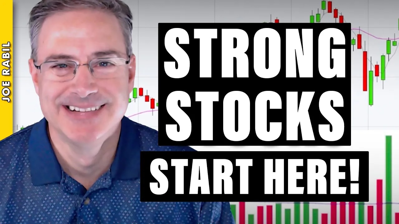
In this video, Joe analyzes which sectors to focus on when selecting new stocks. He demonstrates how to use the 18-period simple moving average (SMA) on monthly, weekly, and daily charts to identify the strongest stock patterns and the best timeframes to trade. He then provides chart analysis on the QQQ, IWM, and Bitcoin, before reviewing this week’s symbol requests submitted by viewers.

The video premiered on May 28, 2025. Click this link to watch on Joe’s dedicated page.

Archived videos from Joe are available at this link. Send symbol requests to stocktalk@stockcharts.com; you can also submit a request in the comments section below the video on YouTube. Symbol Requests can be sent in throughout the week prior to the next show.

In this must-see market update, Larry Williams returns with timely stock market analysis, trading insights, and macroeconomic forecasts. Discover what’s next for the Federal Reserve, interest rates, and inflation — and how it could impact top stocks like Tesla (TSLA), Nvidia (NVDA), Apple (AAPL), and consumer staples (XLP).

This video originally premiered on May 27, 2025. Watch on StockCharts’ dedicated Larry Williams page!

Previously recorded videos from Larry are available at this link.

In this video, Chip Anderson, President of StockCharts, sits down with Tony for a conversation in the StockCharts studio! During this in-depth Q&A session, Chip and Tony explore the powerful features that make the OptionsPlay add-on a must-have for options traders using the StockCharts platform. They discuss the integration of the StockCharts Scanning Engine with OptionsPlay strategies—showcasing how this tool enhances your ability to find trade setups quickly and effectively.

This video premiered on May 23, 2025.

Confused by mixed market signals? Follow along as Julius analyzes sector rotation, asset rotation, and global market trends using daily and weekly Relative Rotation Graphs (RRGs).

In this video, Julius puts the current sector rotation in perspective on both weekly and daily Relative Rotation Graphs (RRGs). He also examines asset rotation and the position of the U.S. markets in relation to international equities.

This video was originally published on May 27, 2025. Click on the icon above to view on our dedicated page for Julius.

Past videos from Julius can be found here.

#StayAlert, -Julius

Get the latest stock market update with Mary Ellen McGonagle. Learn key downside signals, how to manage pullbacks, and which earnings reports could impact the market next week.

In this week’s episode, Mary Ellen reviews where the markets currently stand and what to watch for to signal further downside. She also highlights ways to combat inevitable pullbacks and shares the key earnings reports that are likely to move the markets in the upcoming week.

This video originally premiered May 23, 2025. You can watch it on our dedicated page for Mary Ellen’s videos.

New videos from Mary Ellen premiere weekly on Fridays. You can view all previously recorded episodes at this link.

If you’re looking for stocks to invest in, be sure to check out the MEM Edge Report! This report gives you detailed information on the top sectors, industries and stocks so you can make informed investment decisions.


Technology Back in Top-5

Last week’s market decline of 2-2.5% (depending on the index) has led to some notable shifts in sector performance and rankings.

This pullback, coming after a strong rally, is changing the order of highs and lows on the weekly chart — a particularly significant development, at least for me.

Let’s dive into the details and see what’s flying around in the market.

The composition of the top five sectors has seen some notable changes. Here’s how it stands now:

The big surprise here is Technology making its way into the top five, displacing Consumer Staples (now at #6). This shift suggests a gradual move from a more defensive positioning to sectors that are more cyclical and economically sensitive.

Another eye-catching move comes from Consumer Discretionary, jumping from #10 to #7 — a significant leap, albeit still in the bottom half of the ranking. Real Estate and Materials saw minor shifts, while Energy dropped to #10 and Health Care remains at #11.

  1. (1) Industrials – (XLI)
  2. (4) Communication Services – (XLC)*
  3. (3) Utilities – (XLU)
  4. (2) Financials – (XLF)*
  5. (6) Technology – (XLK)*
  6. (5) Consumer Staples – (XLP)*
  7. (10) Consumer Discretionary – (XLY)*
  8. (7) Real-Estate – (XLRE)*
  9. (8) Materials – (XLB)*
  10. (9) Energy – (XLE)*
  11. (11) Healthcare – (XLV)

Weekly/Daily RRG Analysis

The weekly Relative Rotation Graph (RRG) provides some interesting insights:

  • Utilities maintains very high readings, but Consumer Staples (highest on RS-Ratio ranking) is likely to be pushed down by weak daily chart readings.
  • Industrials continues to push further into the leading quadrant with stable momentum.
  • Financials and Communication Services are inside the weakening quadrant but have room to curl back towards leading.
  • Technology, despite having the second-lowest RS-Ratio reading, is rapidly improving with a strong RS-Momentum heading over recent weeks.

Remember, the ranking combines daily and weekly readings.

Technology’s high daily chart reading is propelling it into the top five, while Consumer Staples’ weak daily reading is pushing it out.

Industrials: The Leader Holding Strong

XLI is now pushing against its all-time high, just below 145. After two weeks of attempts, last week’s slight market decline confirms that this resistance level has worked.

We’re now looking for where any potential decline might stop and form a new low. The gap area from two weeks ago seems to be a good support area to watch.

The relative strength line breaking out of its consolidation formation continues to drag the RRG lines higher. XLI, for good reason, remains the strongest sector at the moment.

Communication Services: Stable Relative Uptrend

XLC is continuing its move higher with remarkable stability. The uptrend in the RS line is still valid, currently testing the lower boundary of the rising channel.

Due to the lack of upward relative momentum in recent weeks, both RRG lines are now pointing lower.

However, the RS-Ratio line remains well above 100, keeping the XLC tail on the right-hand side of the RRG.

Utilities: Testing Resistance

XLU is pushing against overhead resistance but has yet to manage a decisive break higher.

With defensive sectors under pressure, it’s questionable whether this breakout will happen in the short term.

The RS line versus SPY is dropping back into its trading range, unable to break away decisively. This drop is causing the RS-Momentum line to roll over and start pointing lower.

It’s the recent strength in relative strength that’s keeping Utilities inside the leading quadrant for now.

Financials: At a Crossroads

The Financial sector seems to be respecting the old rising support line as resistance, with the market dropping off that line last week and now trading around $50.

This move is affecting the relative strength line, which has returned to the lower boundary of the rising channel — a level that needs to hold to maintain a positive outlook for XLF.

The RS-Ratio line is stable around 102.50, high enough to keep Financials on the right-hand side of the graph.

The RS-Momentum line has just dropped below 100, positioning the XLF tail inside the weakening quadrant, but with enough room to curl back up before hitting lagging.

Technology: The Week’s Winner

XLK saw a significant jump two weeks ago and has since returned to test the old resistance area as support. If last week’s decline continues, there’s a bit more room to the downside — $220 seems to be a good level to watch for support, marking the bottom of the gap range from two weeks ago.

The jump has pushed the relative strength line above its falling resistance line, a good sign that seems to be breaking the relative downtrend in place since mid-last year.

This is changing the characteristics of the relative strength move for the Technology sector.

For now, it has only pushed the RS-Momentum line above 100, moving XLK into the improving quadrant on the weekly RRG, but it’s already starting to drag the RS-Ratio line higher.

Portfolio Performance

We’re clawing back some of the losses from recent weeks. The underperformance of almost 6% last week has now shrunk to 4.6%. Still behind the benchmark, but closing in again and narrowing the gap.

It’s a long-term game, so we keep pushing forward. So far, nothing out of the ordinary. Let’s wait and see whether we’ve seen the low in underperformance and how long it will take to return to SPY’s performance since inception.

#StayAlert –Julius